Back to work
Case Study
Web Design
Development
F&B
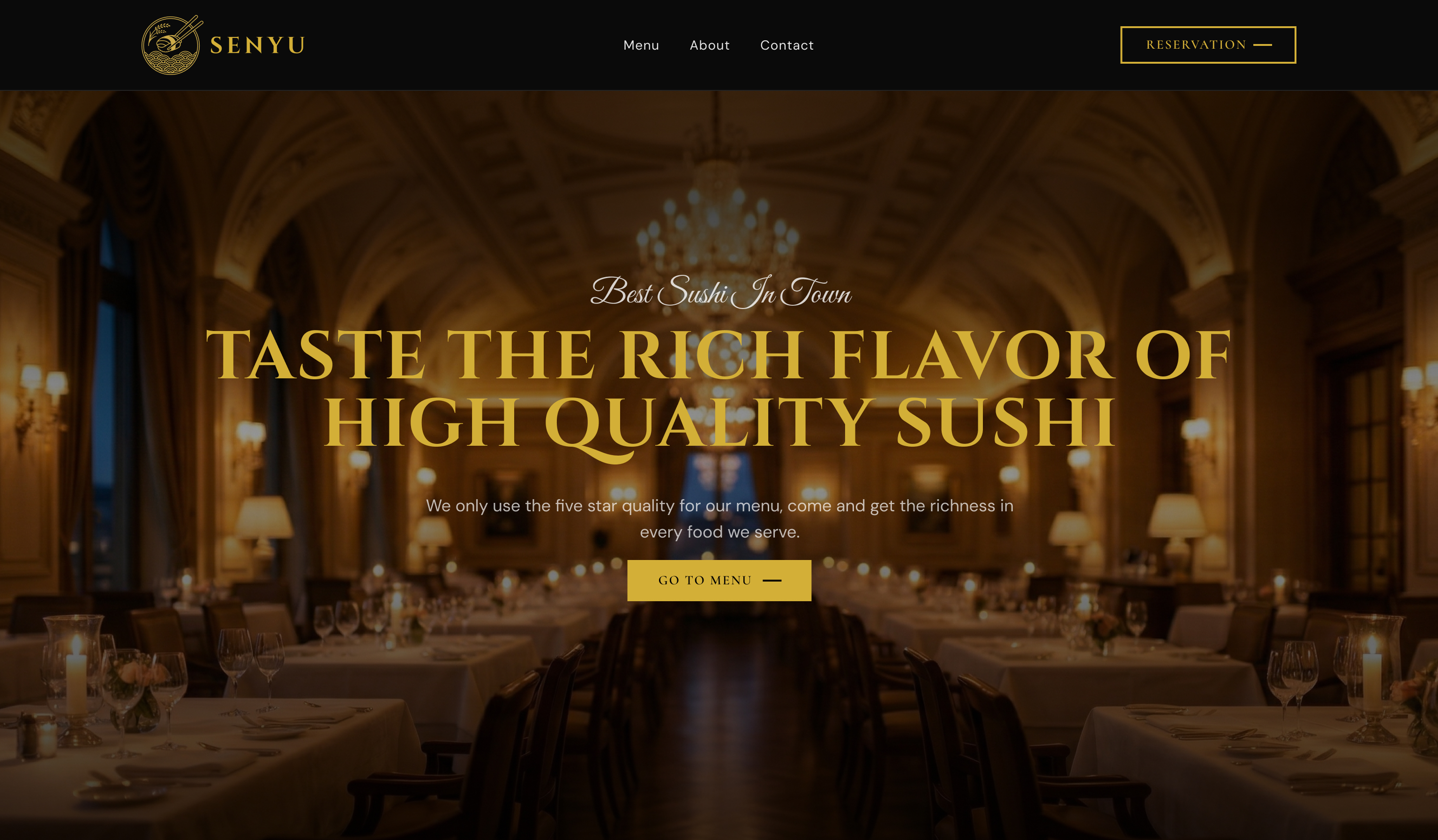
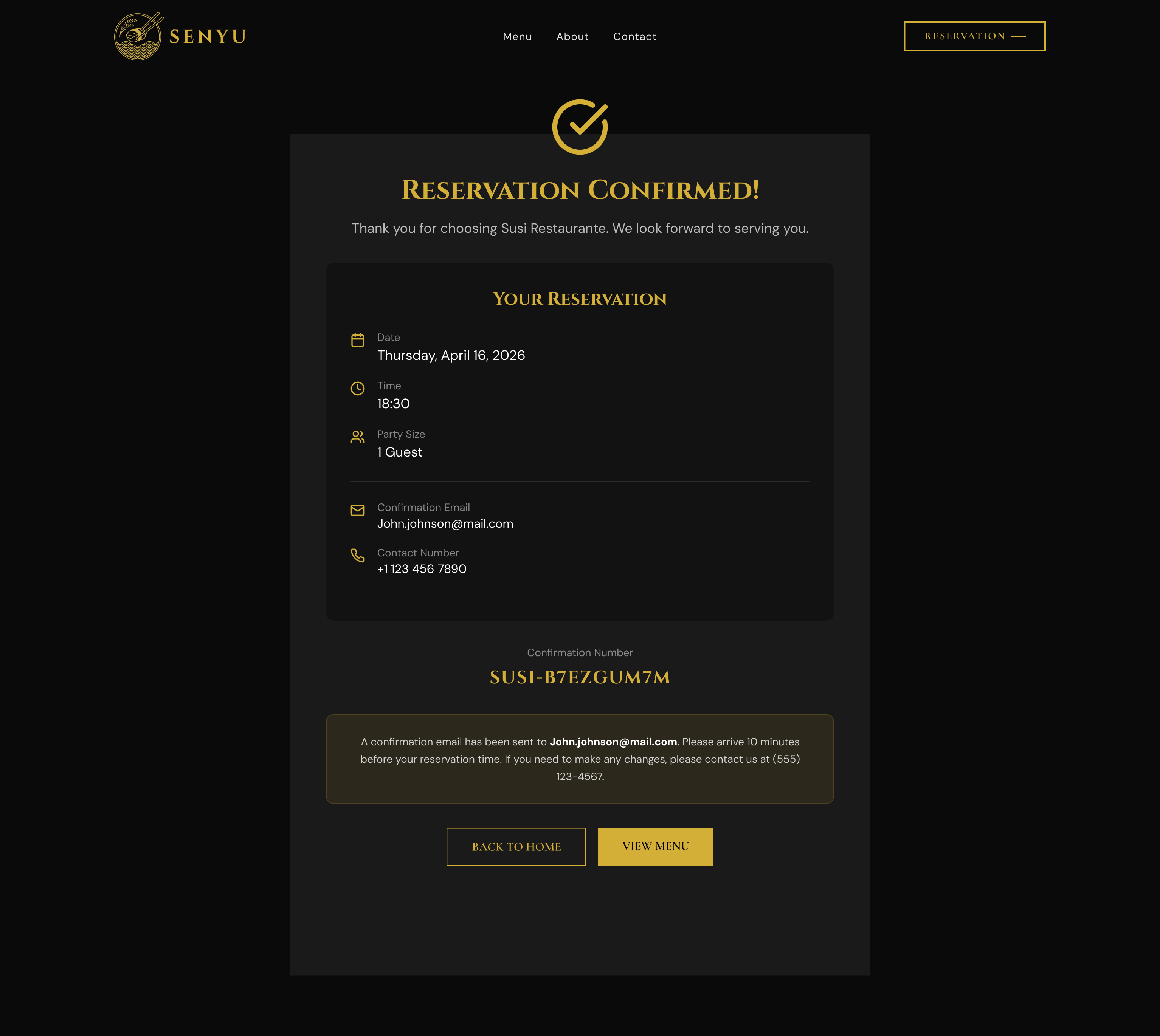
Senyu Fine Dining
Concept project
This is self initiated concept work. No client engagement, no production deployment. The problem, structure, and execution are mine.
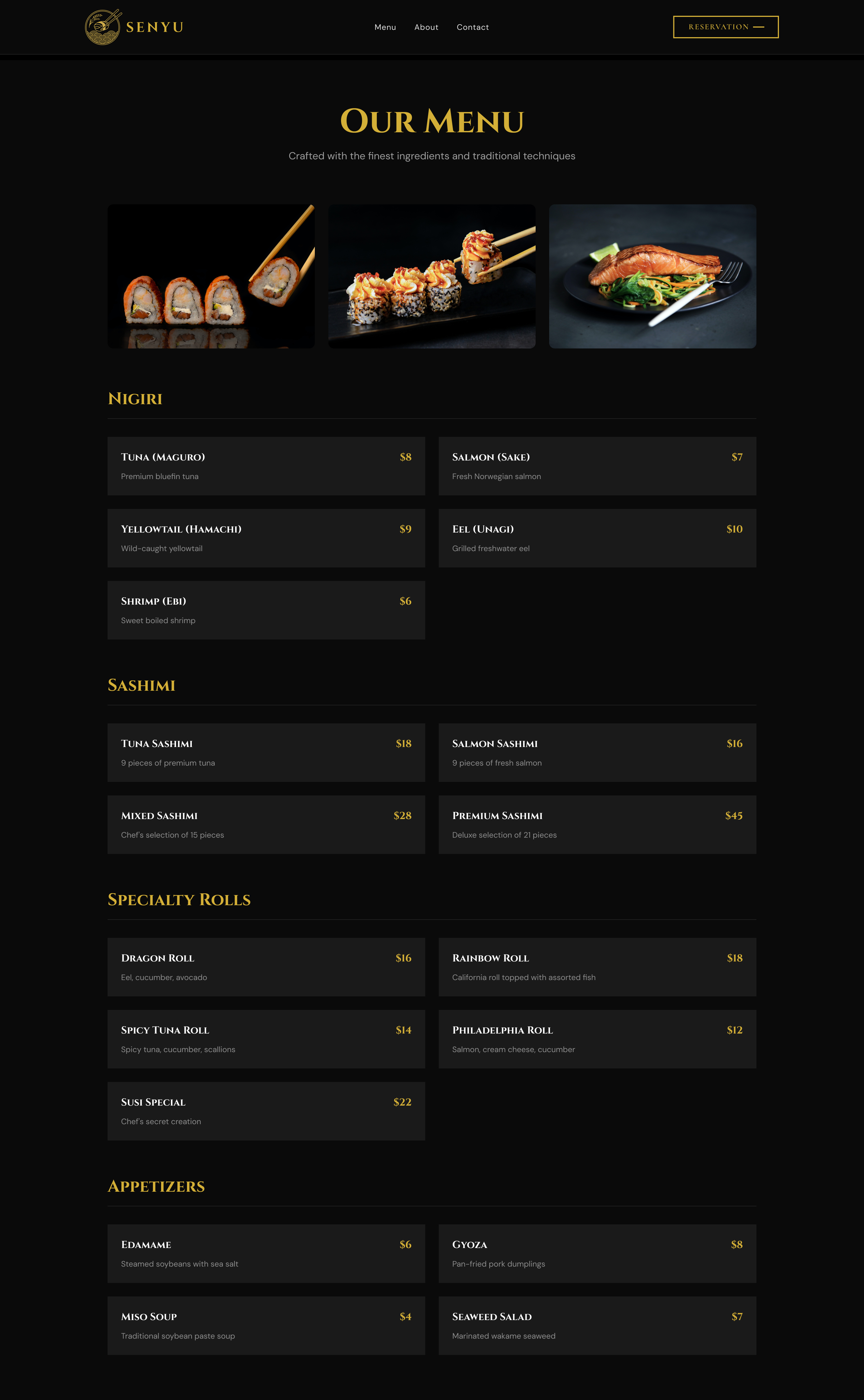
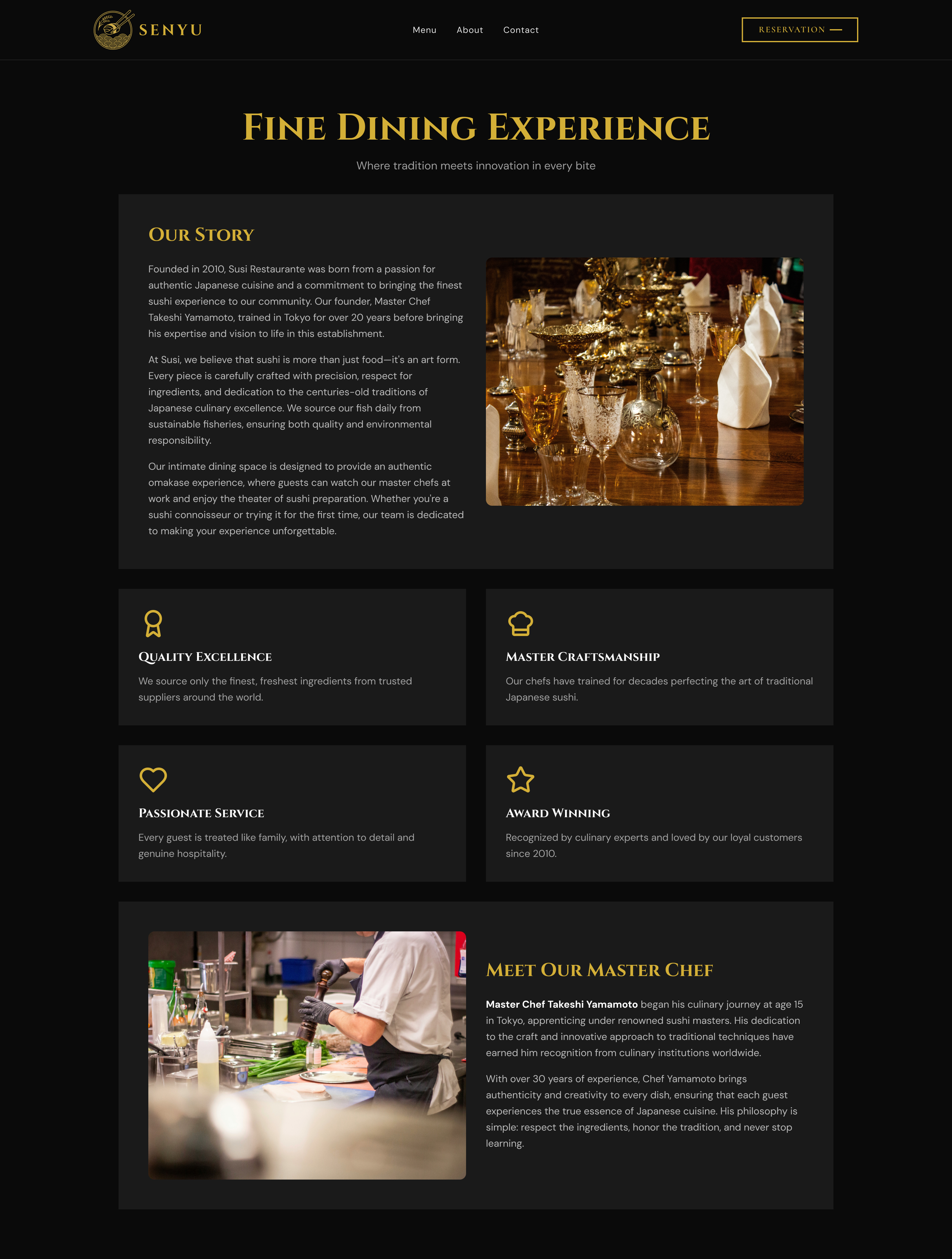
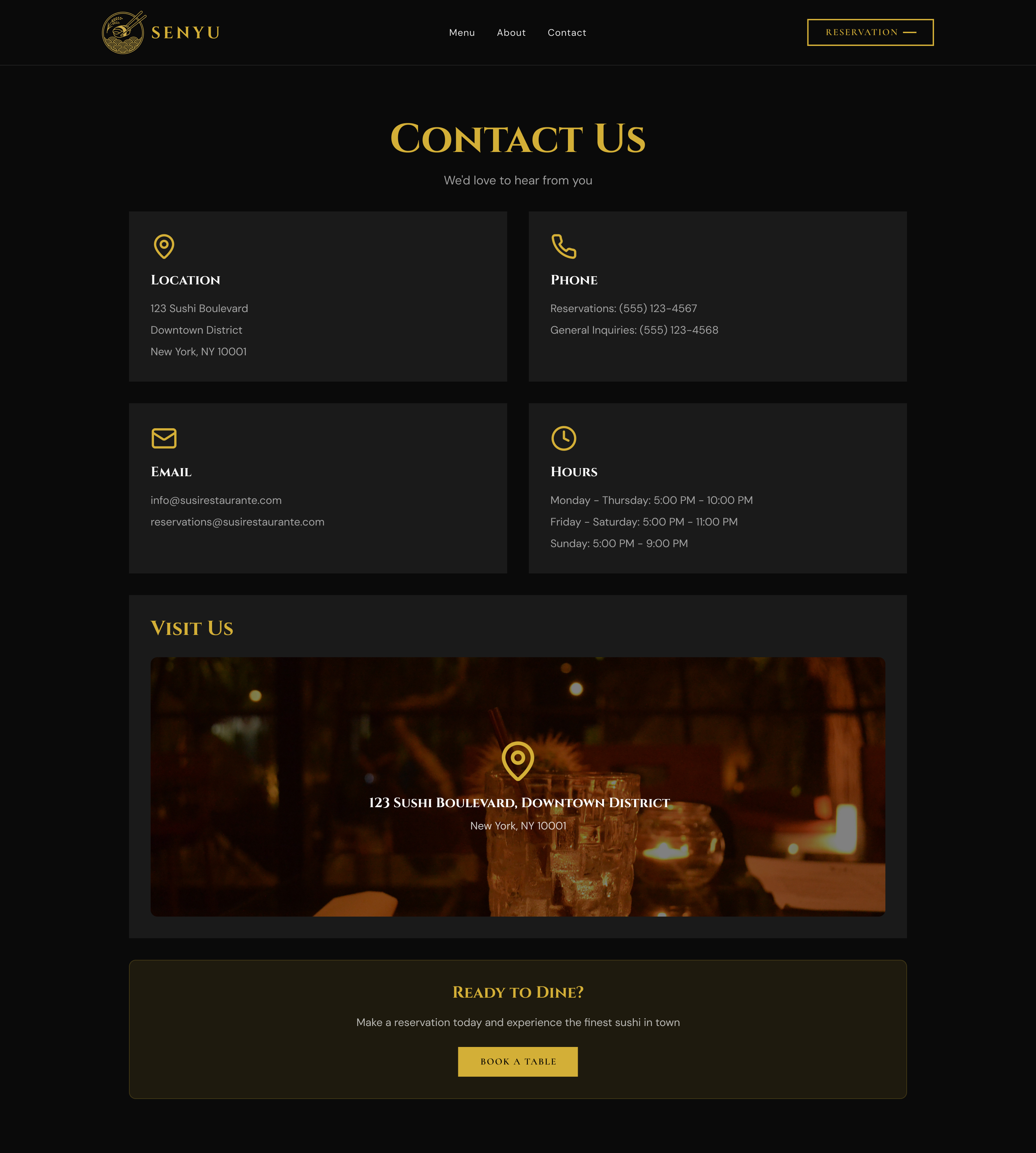
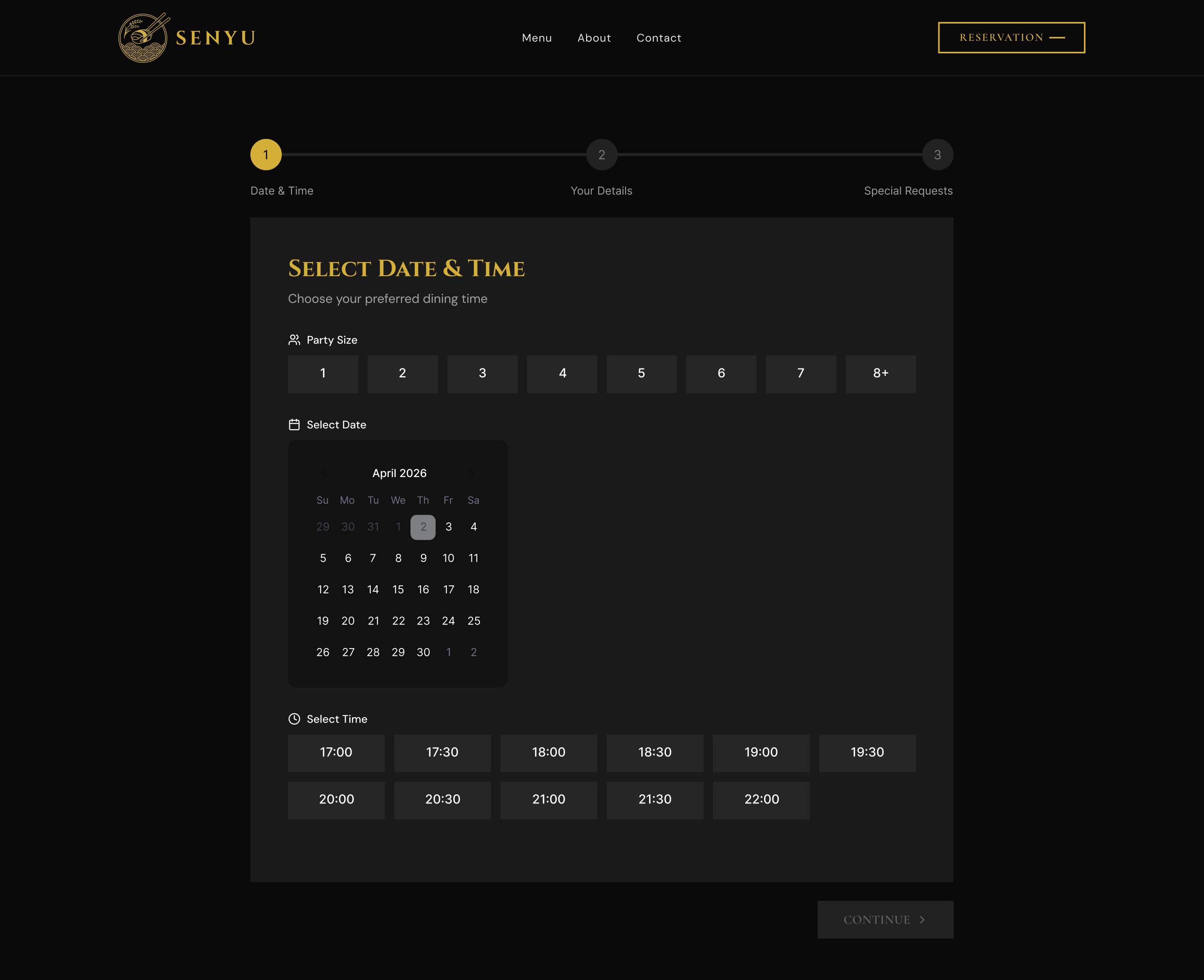
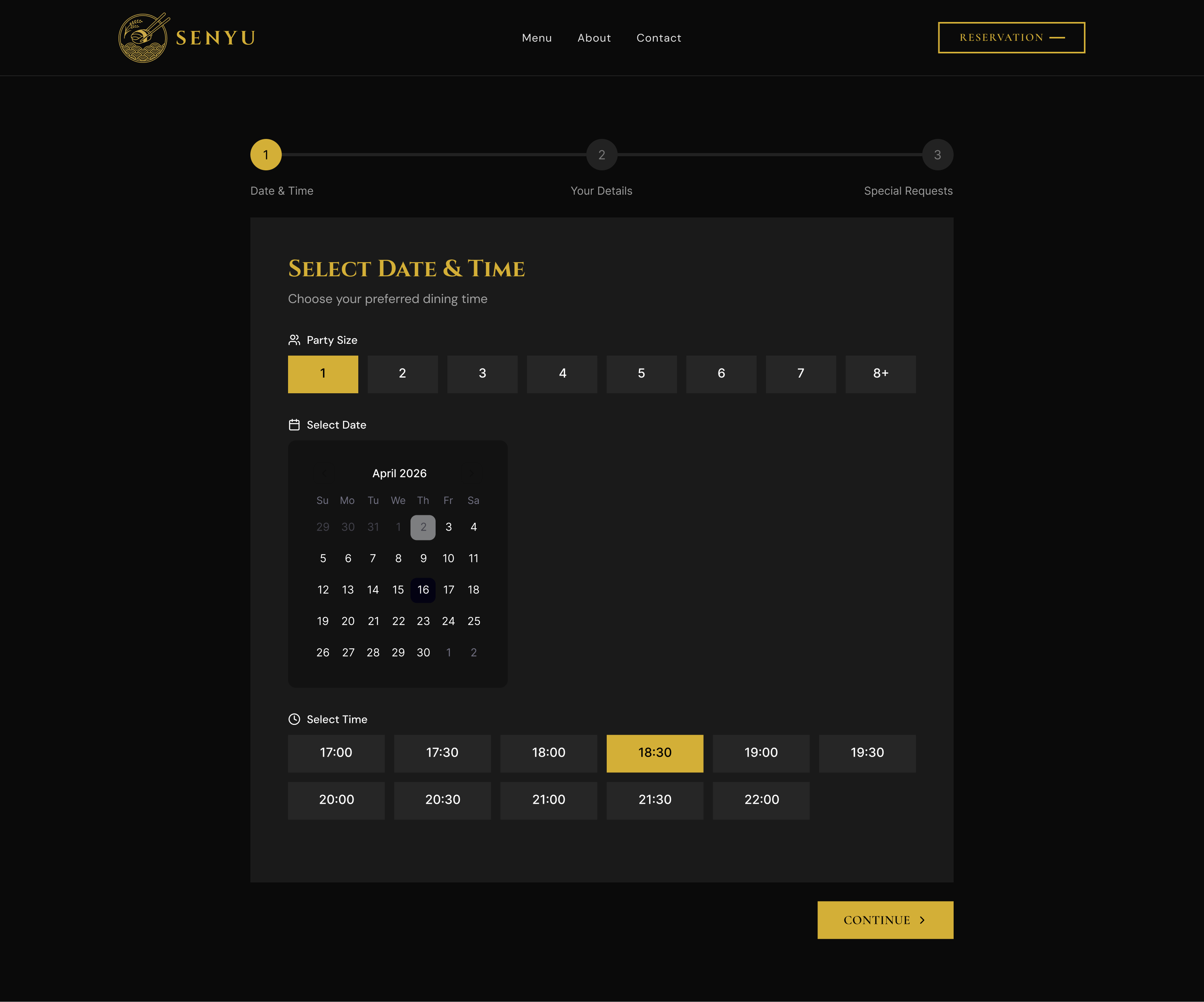
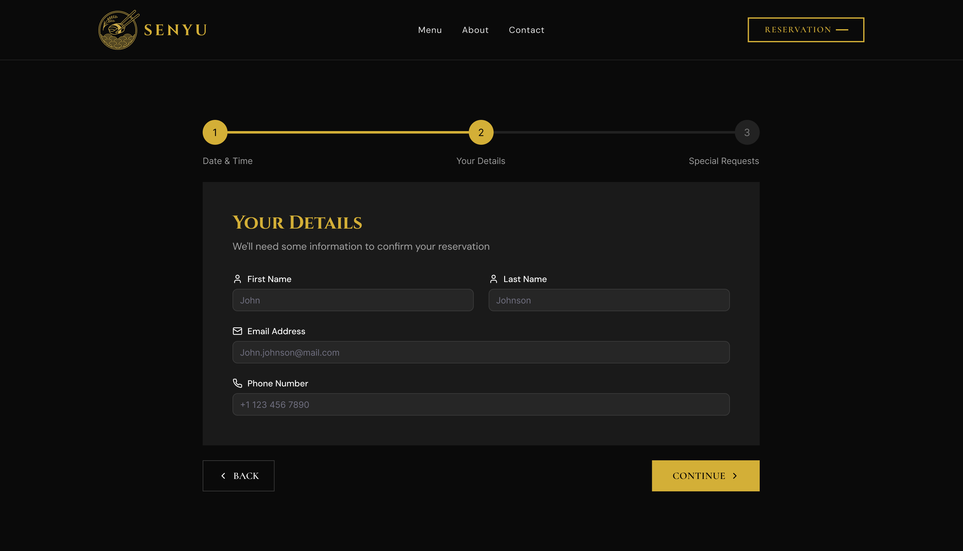
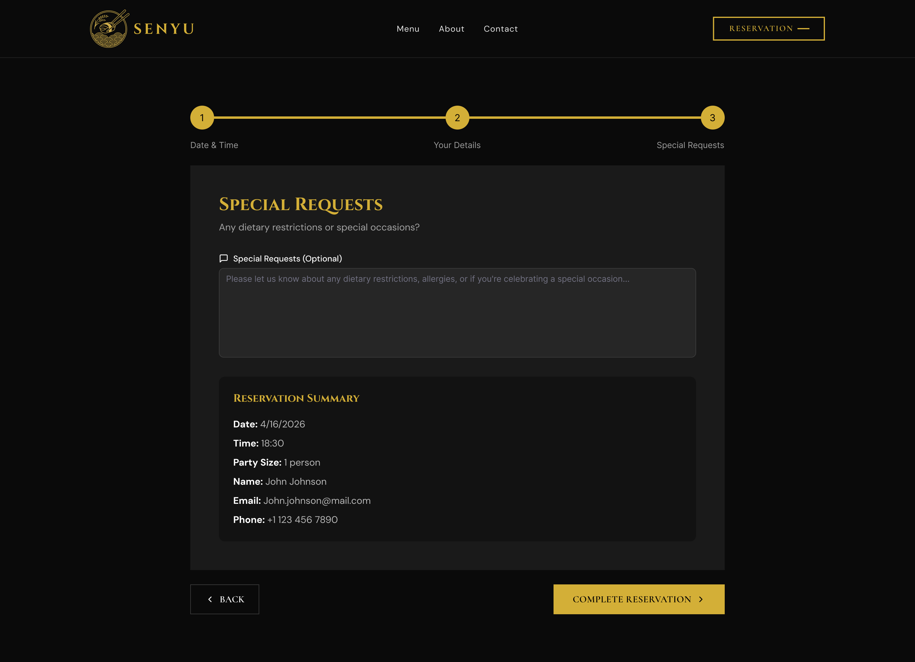
Senyu Fine Dining needed a website that matched the prestige of dining in person. Opulent dark aesthetic, full menu architecture, and an inline reservation system. The digital experience earning every table booking before the door opens.
senyurestaurant.com