Back to work
Case Study
Product Design
Web Application
Healthcare
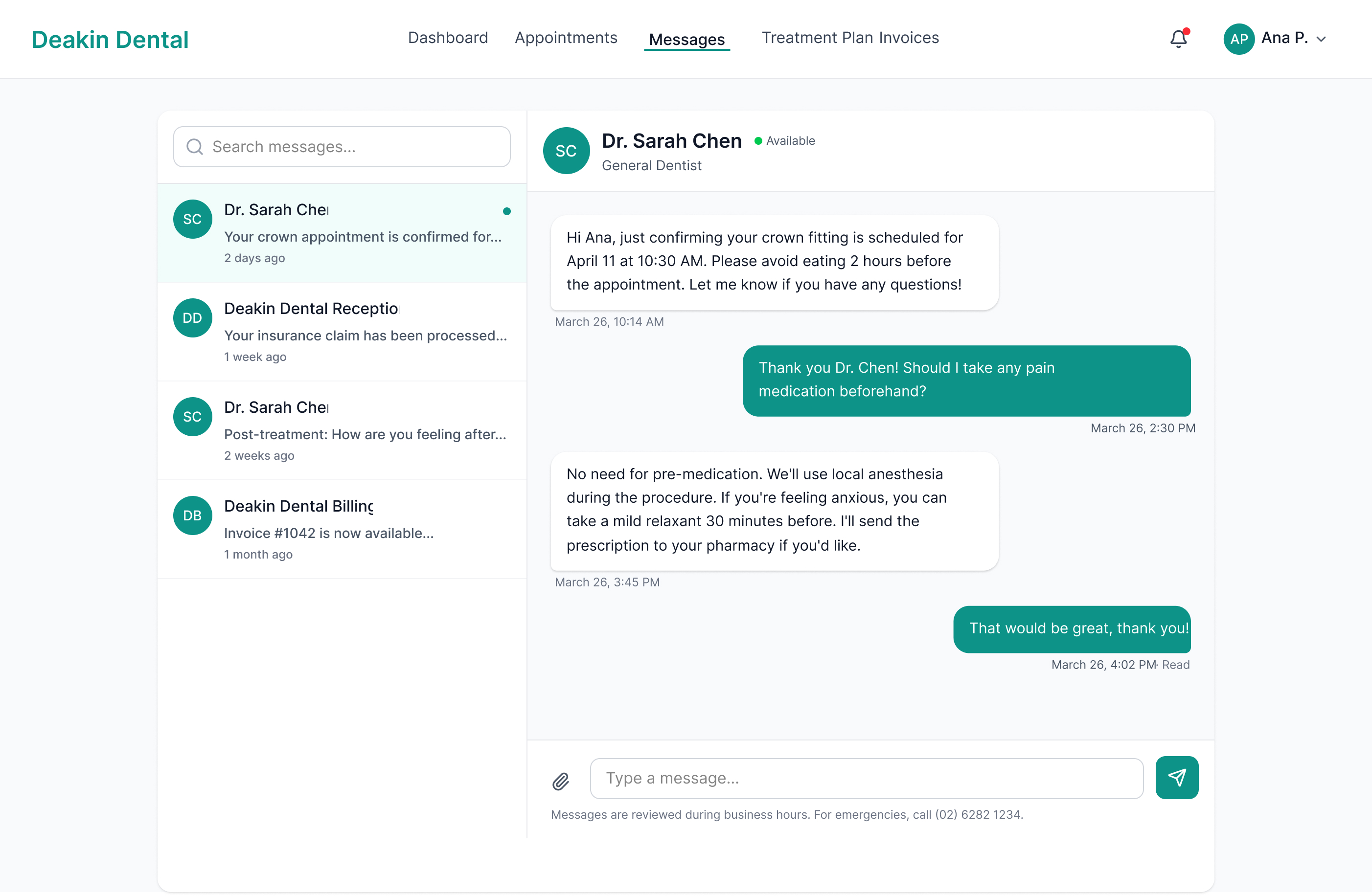
Patient Portal
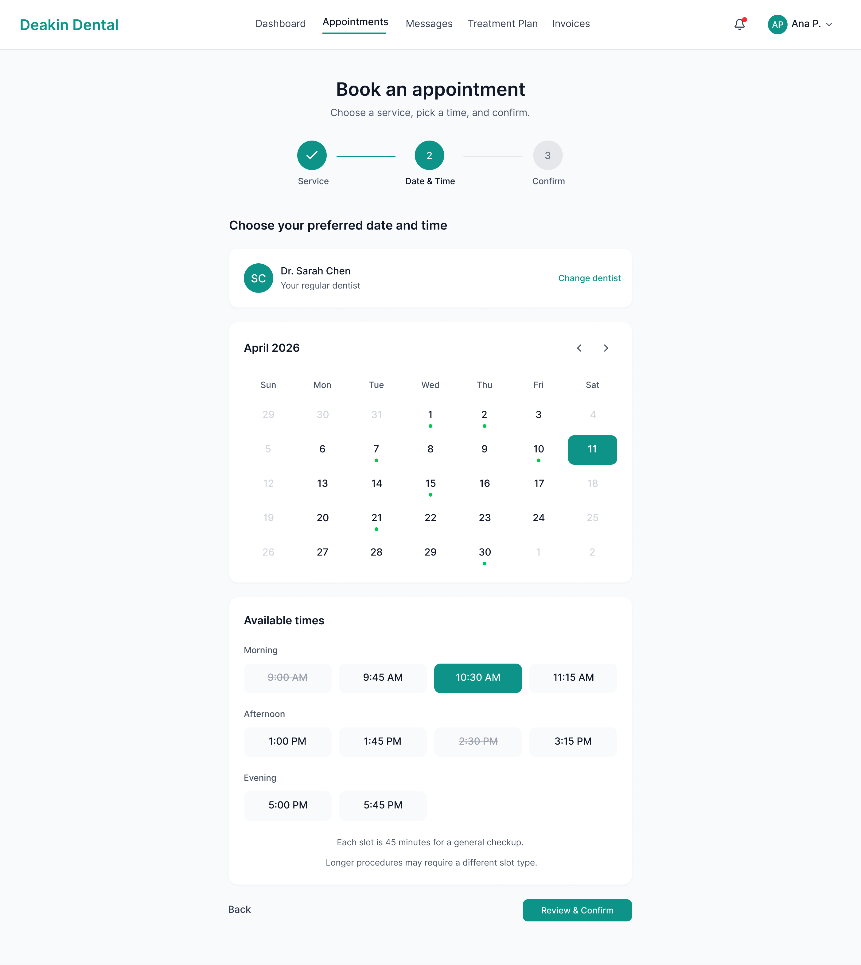
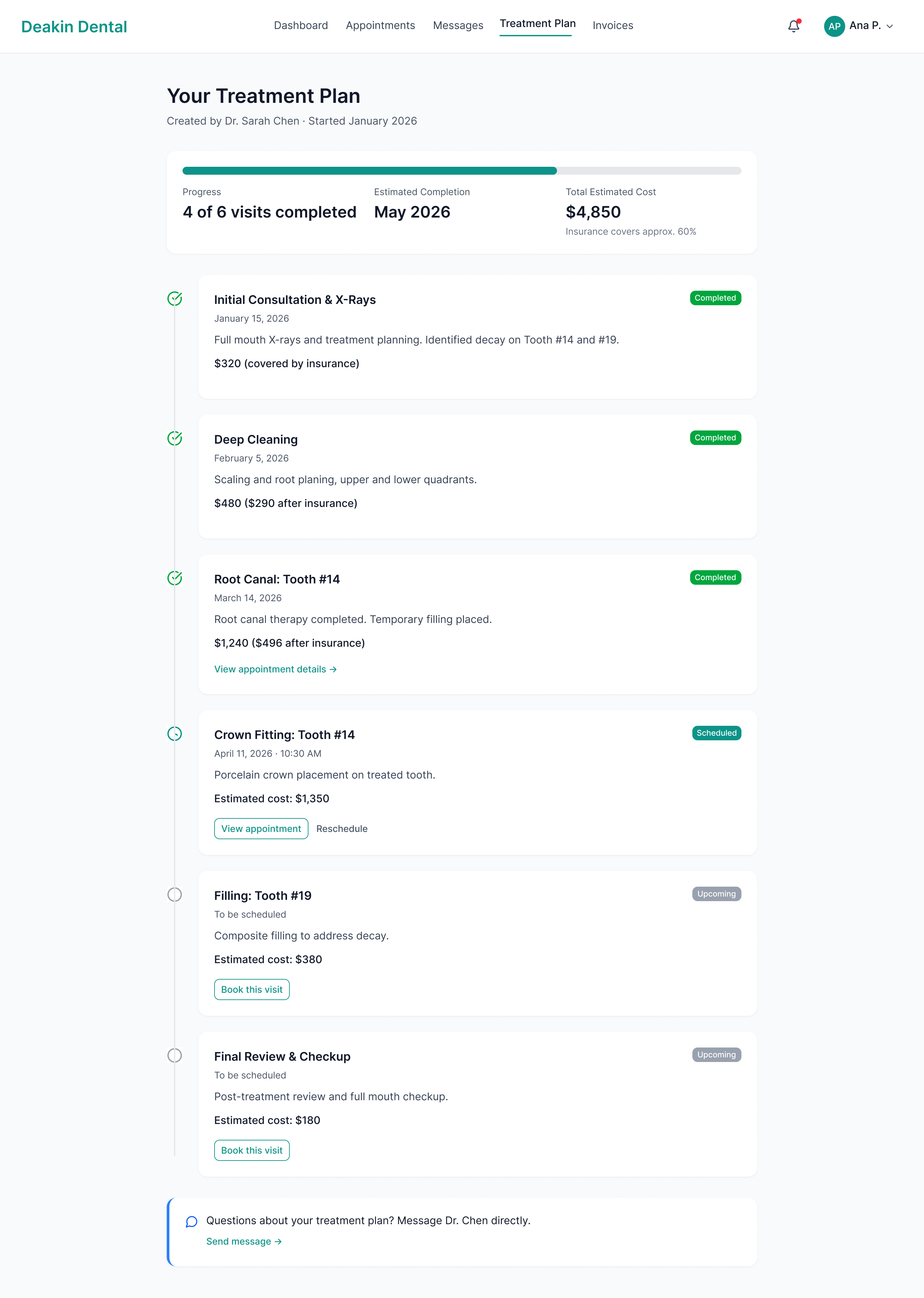
Booking System
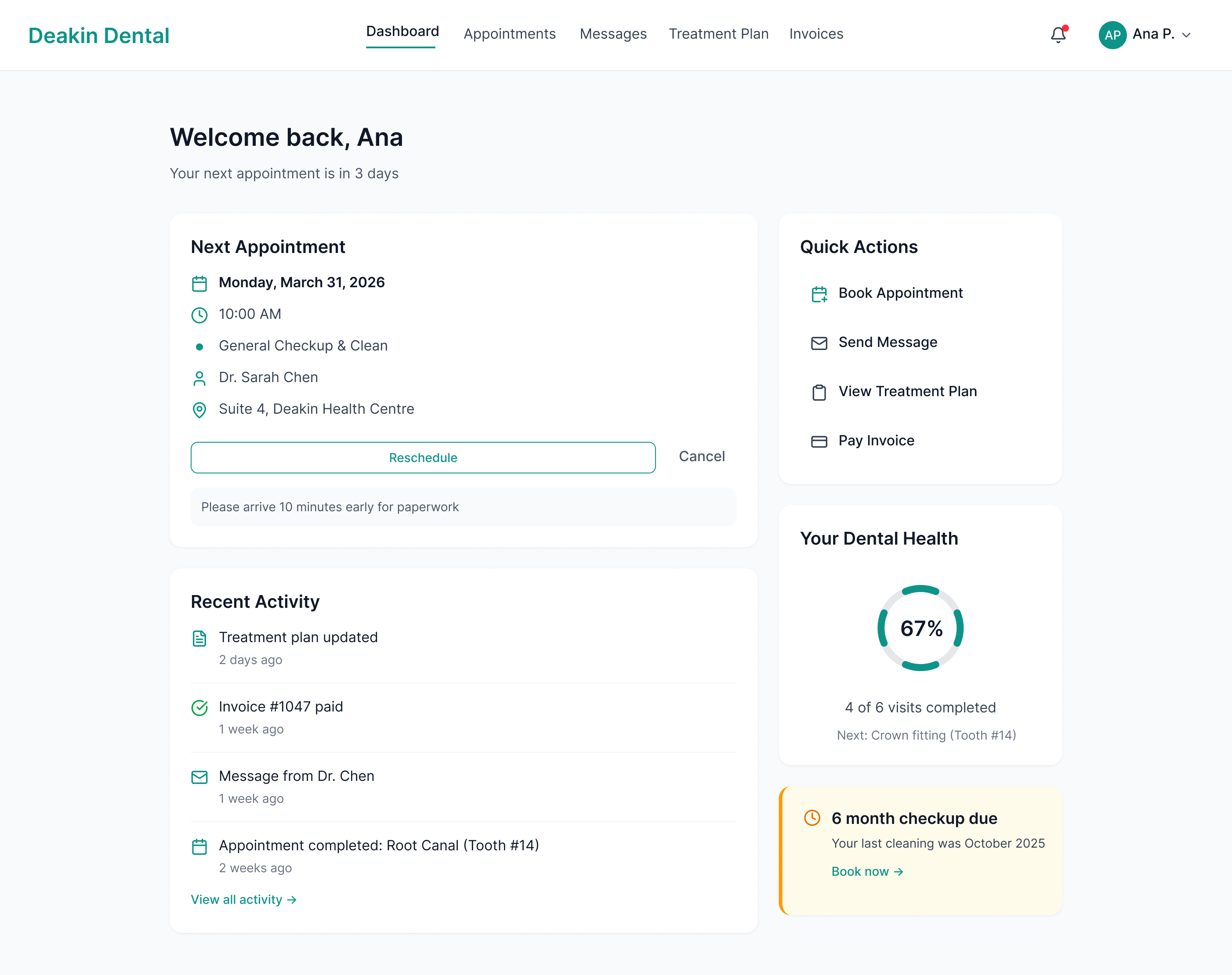
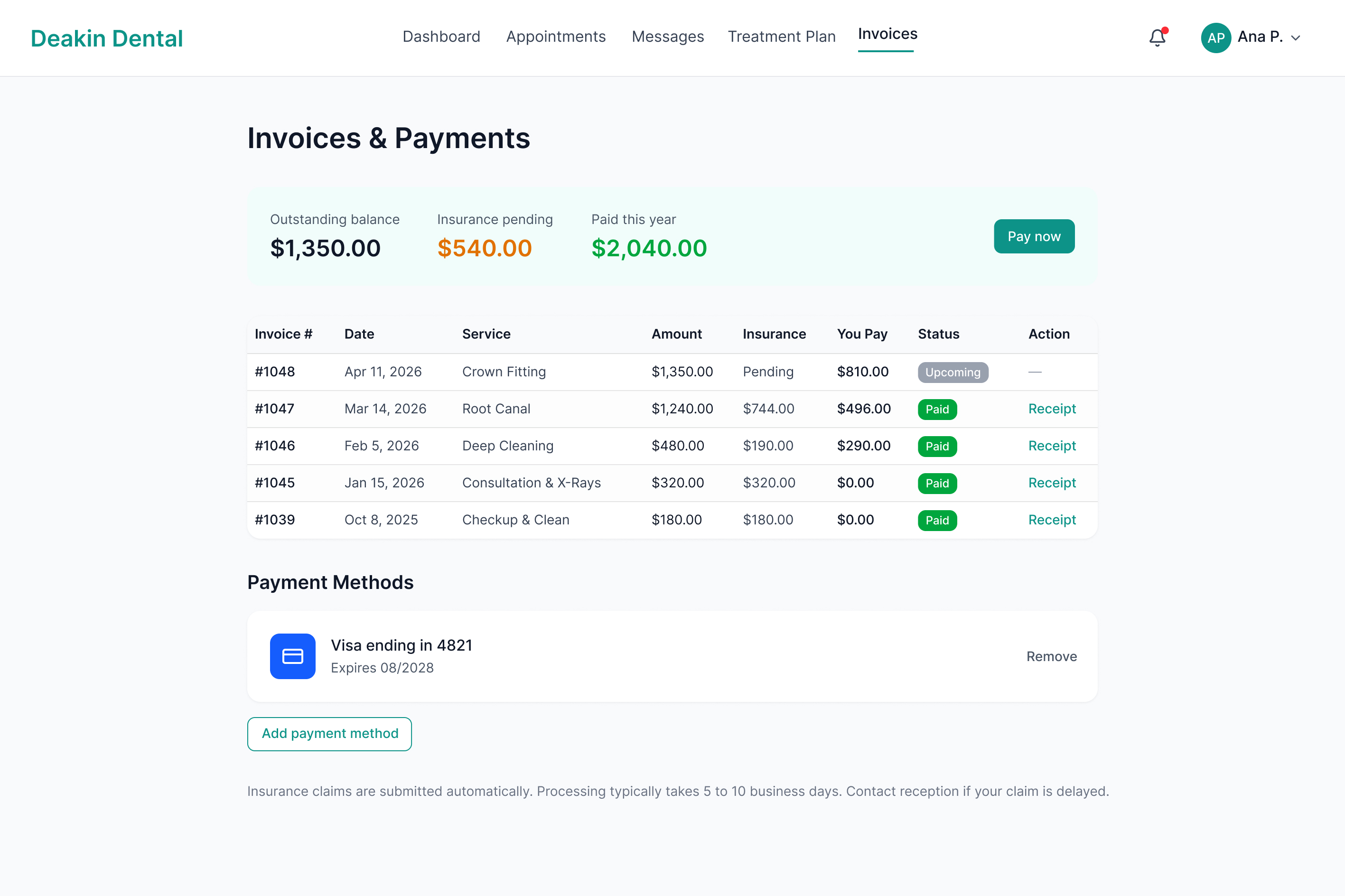
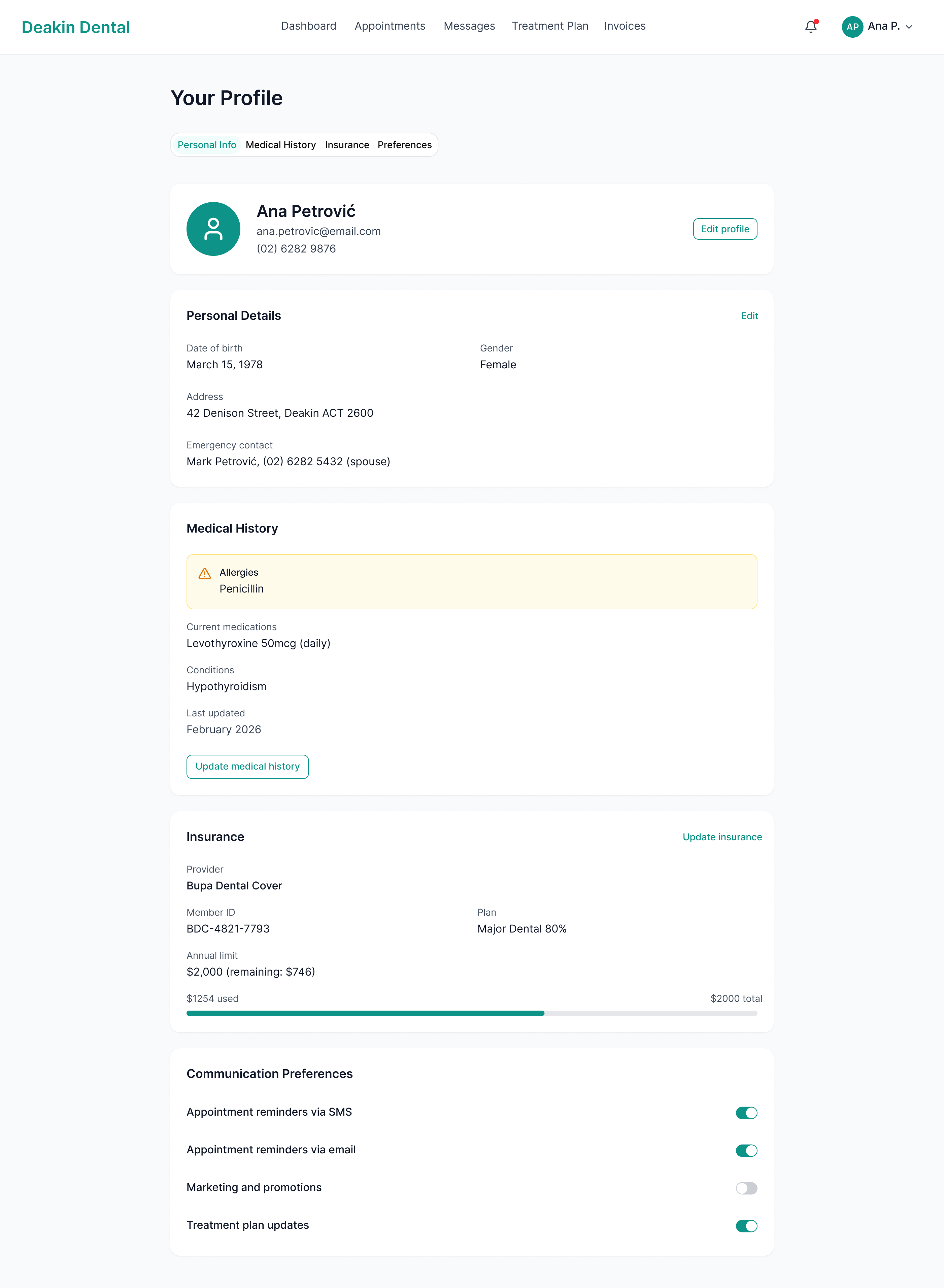
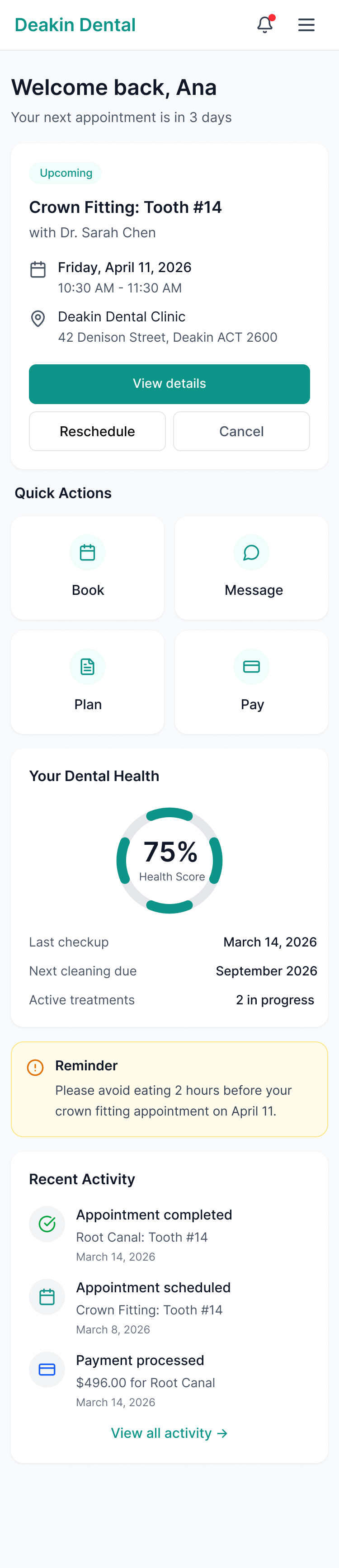
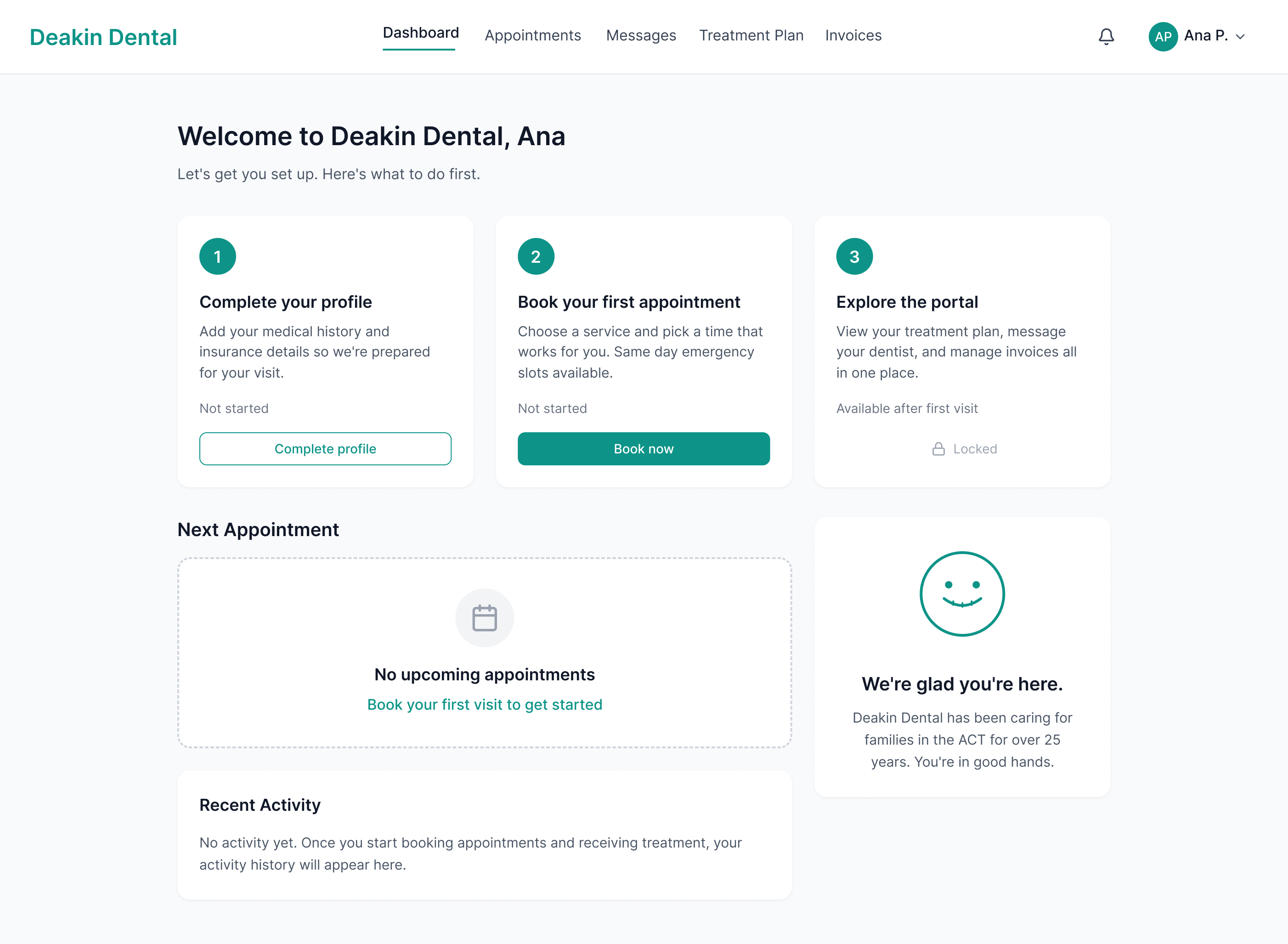
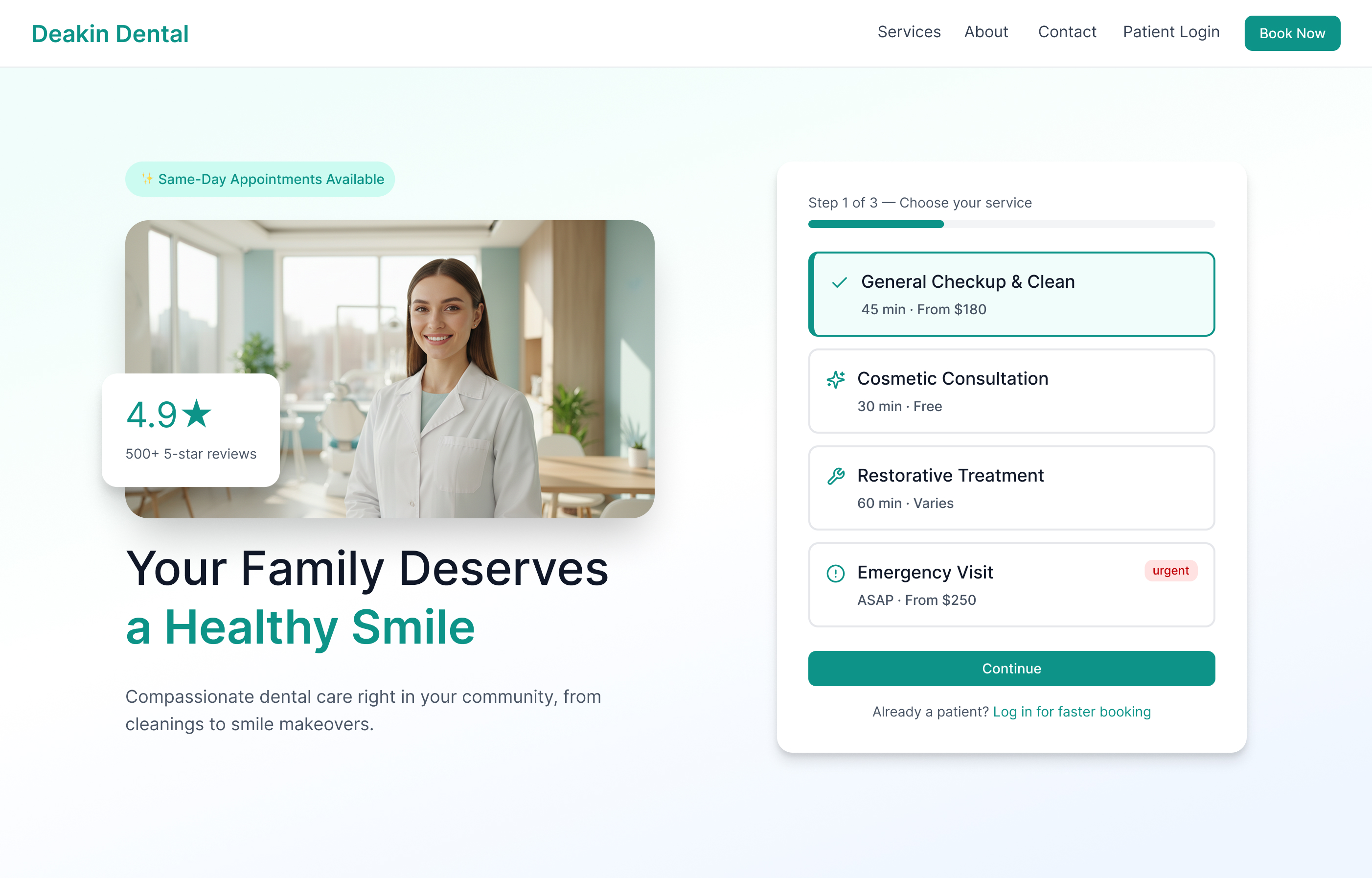
Deakin Dental
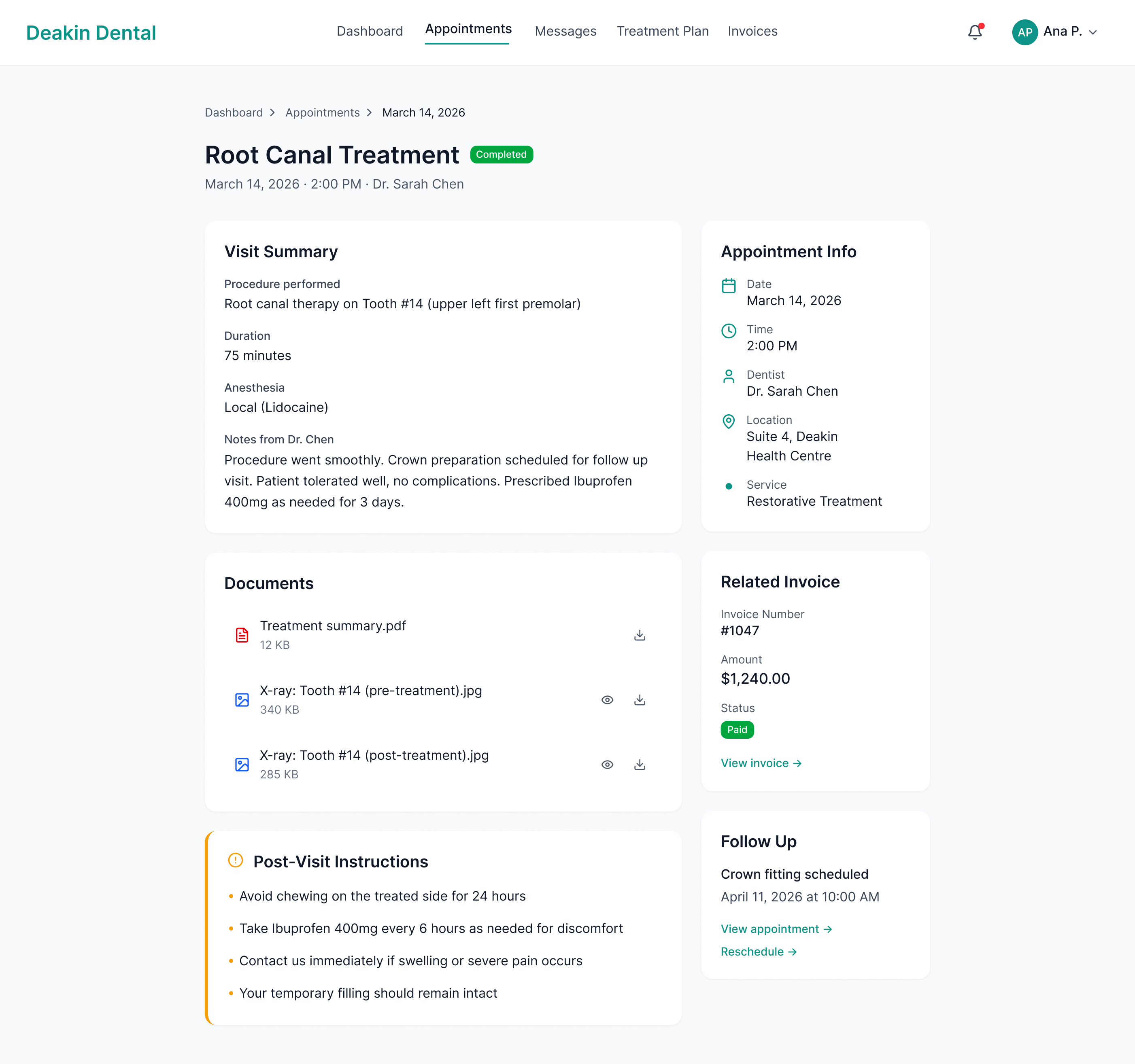
A patient portal and booking flow built for the slowest visitor in the funnel. Anxious patients researching family dentists do not need clever UI. They need calm pages and a path to a booked appointment that does not ask them to think twice.
.jpg)