Back to work
Case Study
Product Design
Dashboard
FinTech
Design System
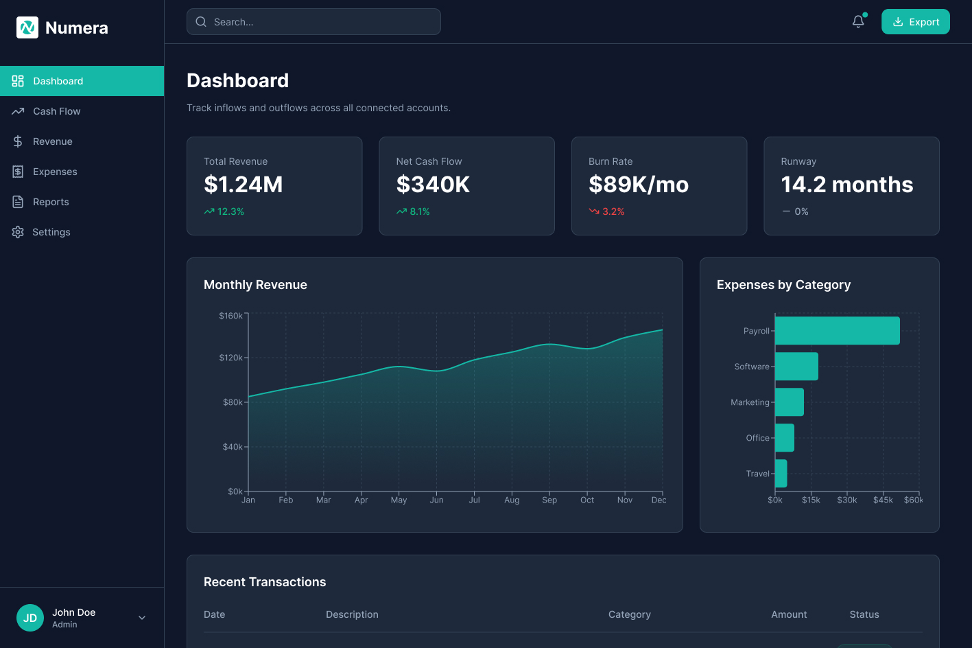
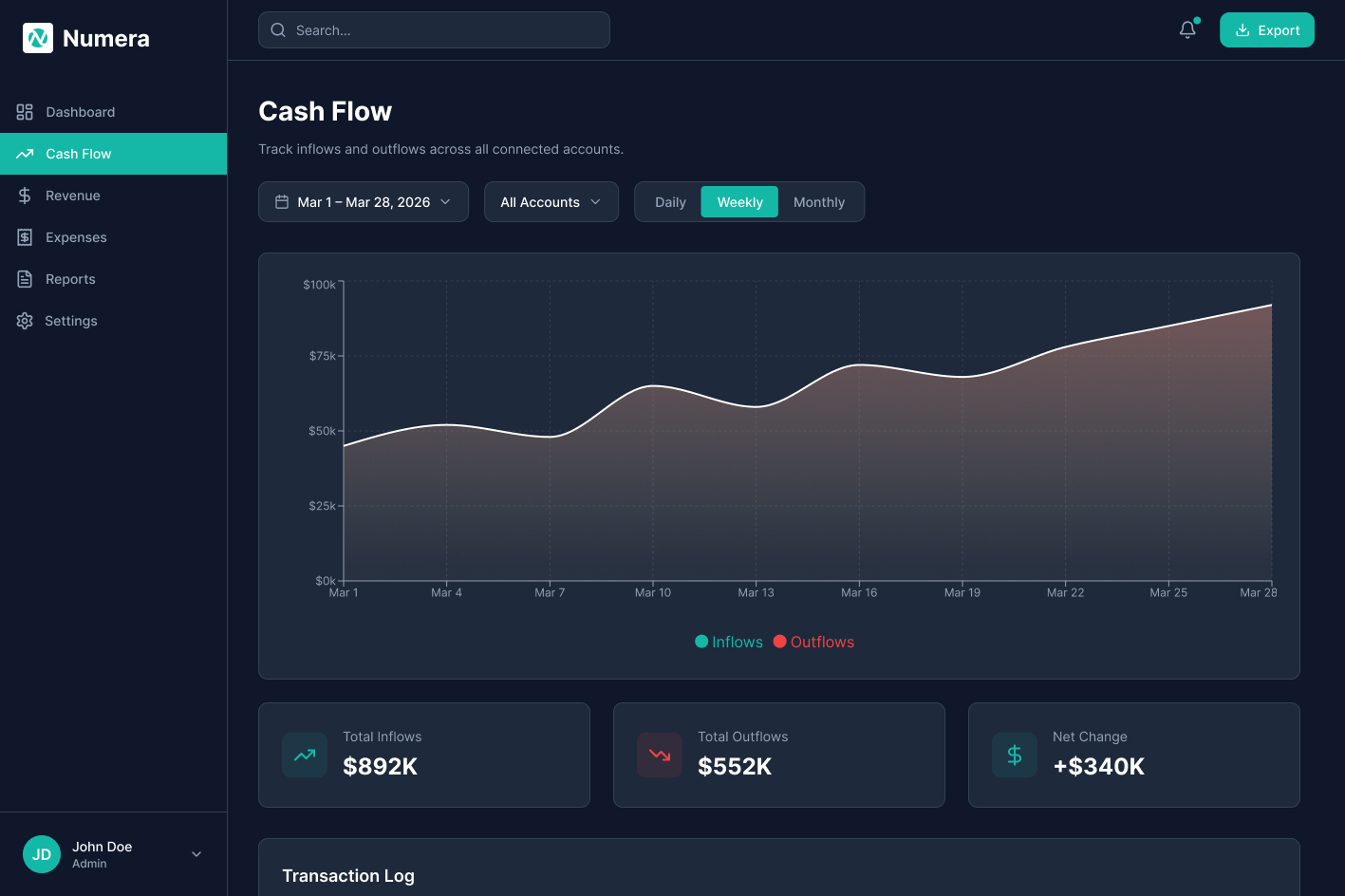
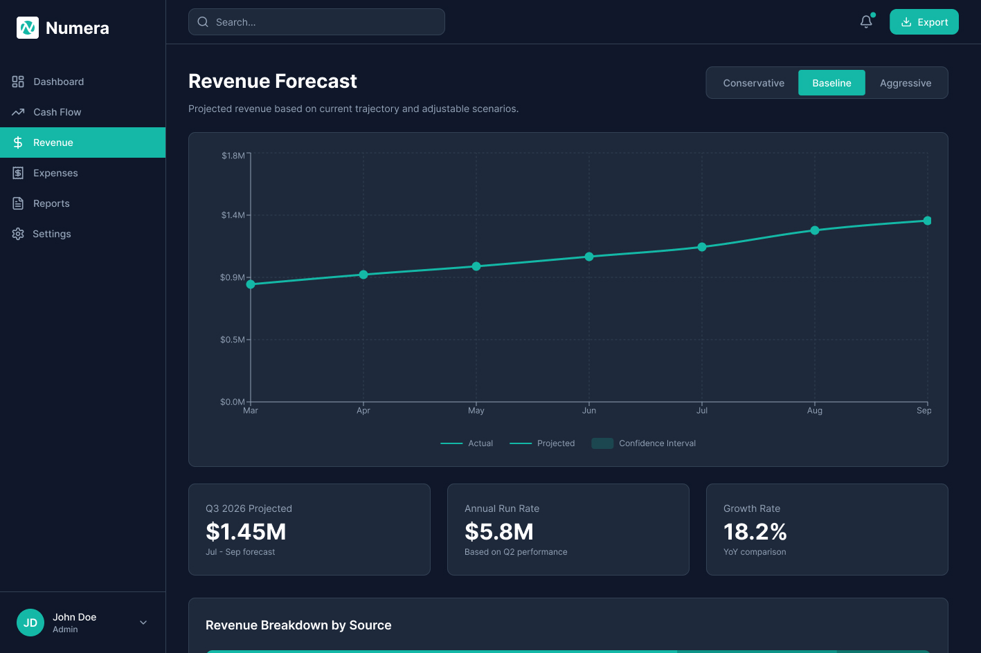
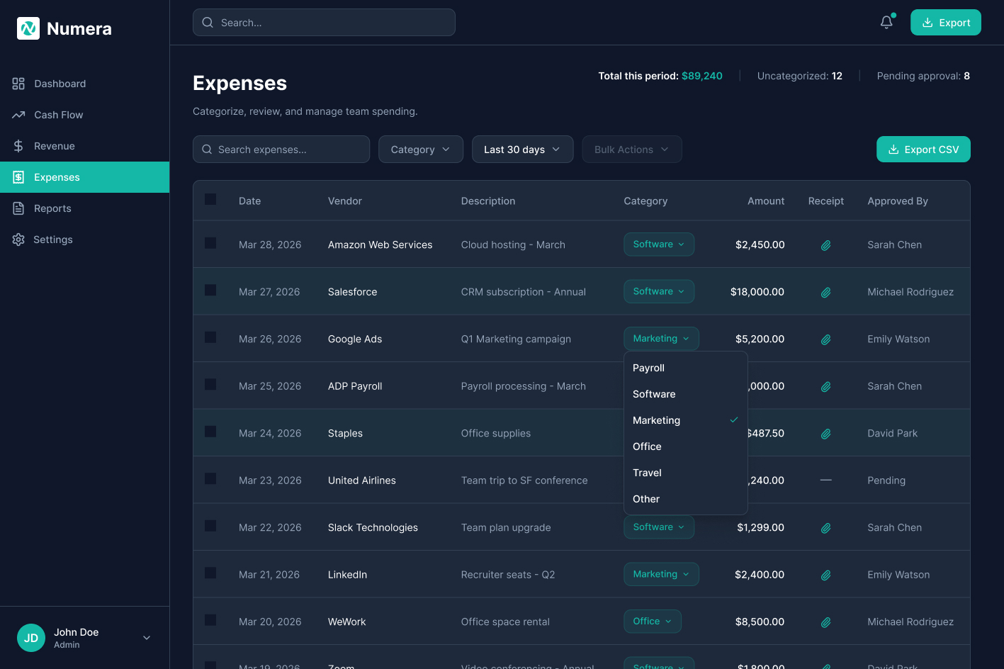
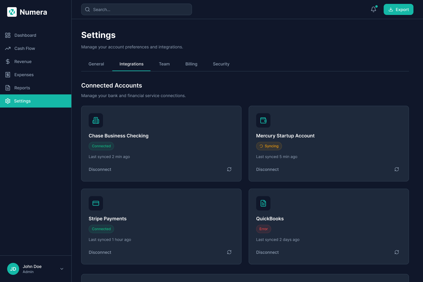
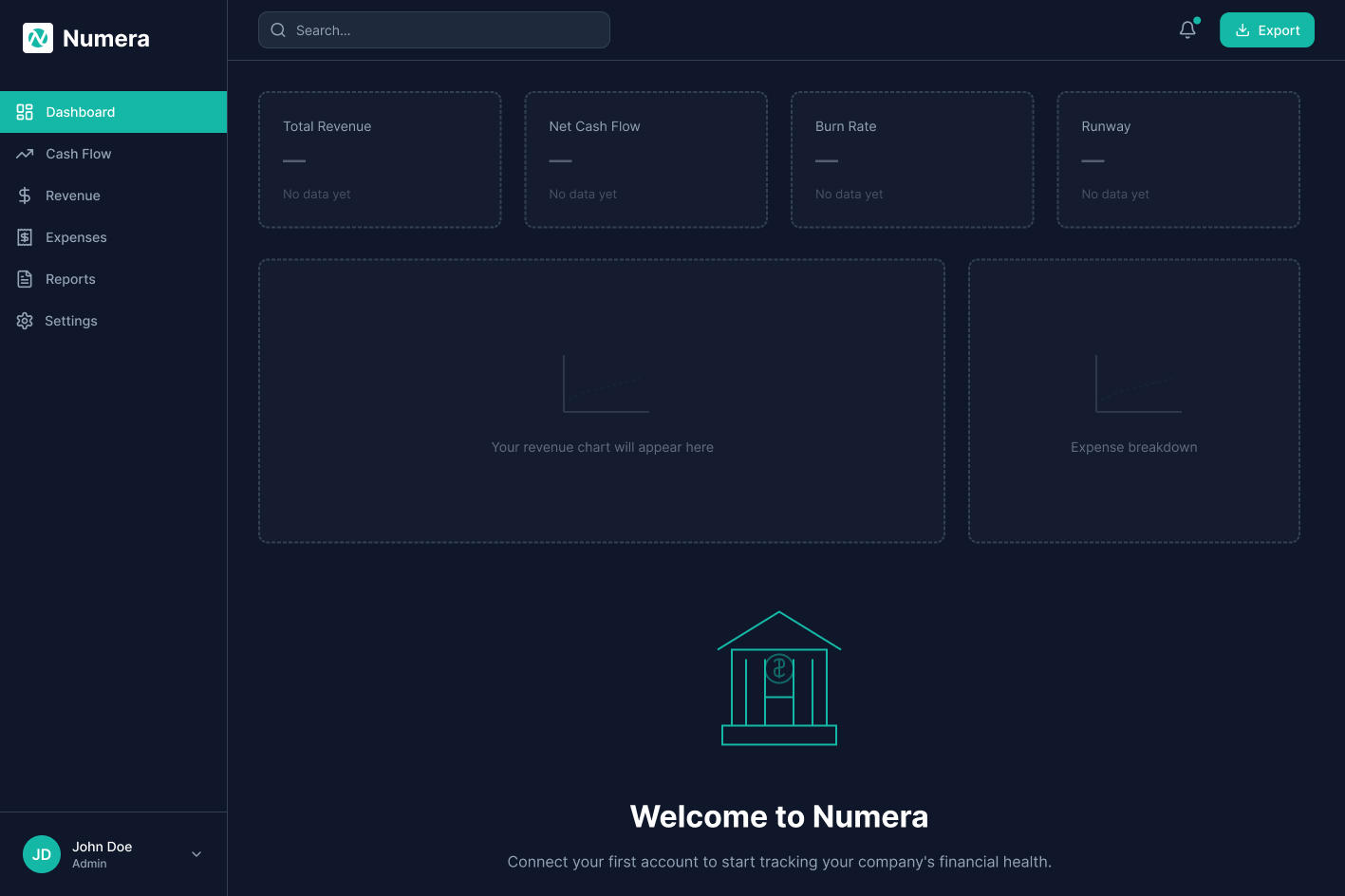
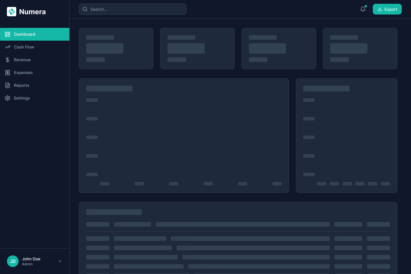
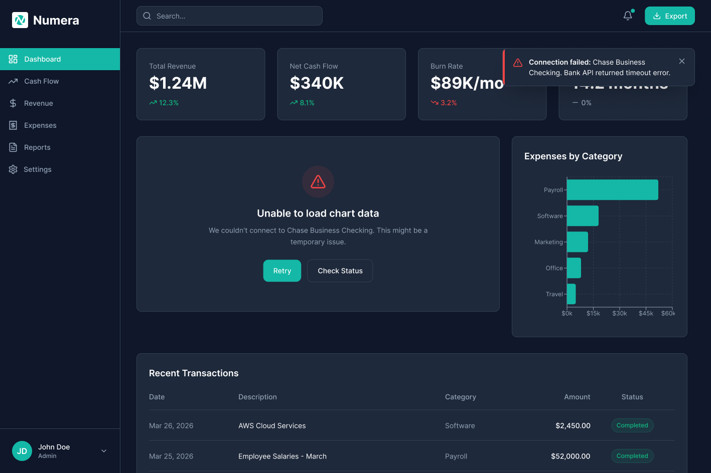
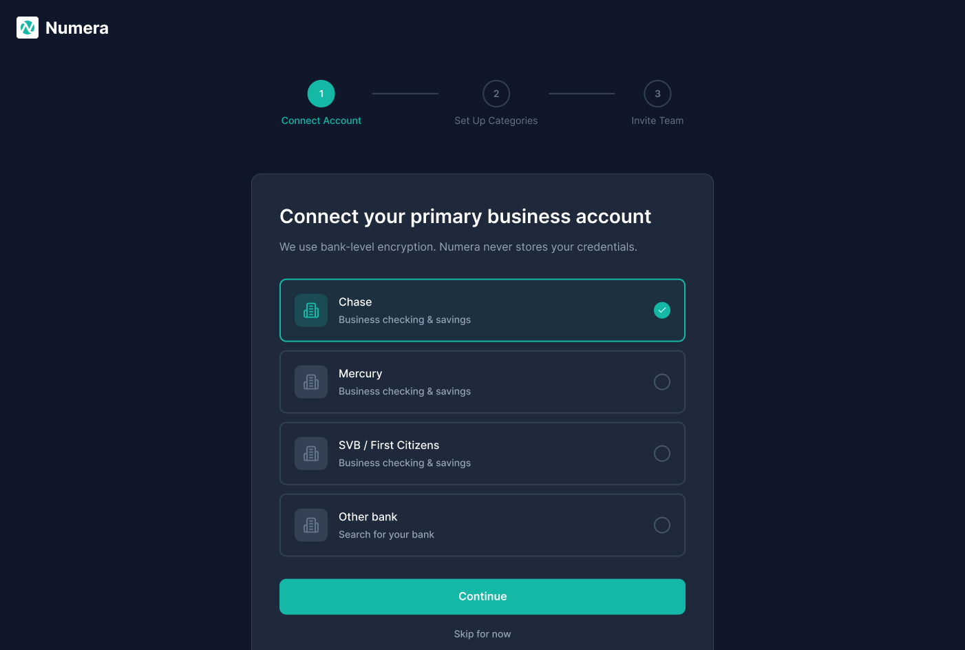
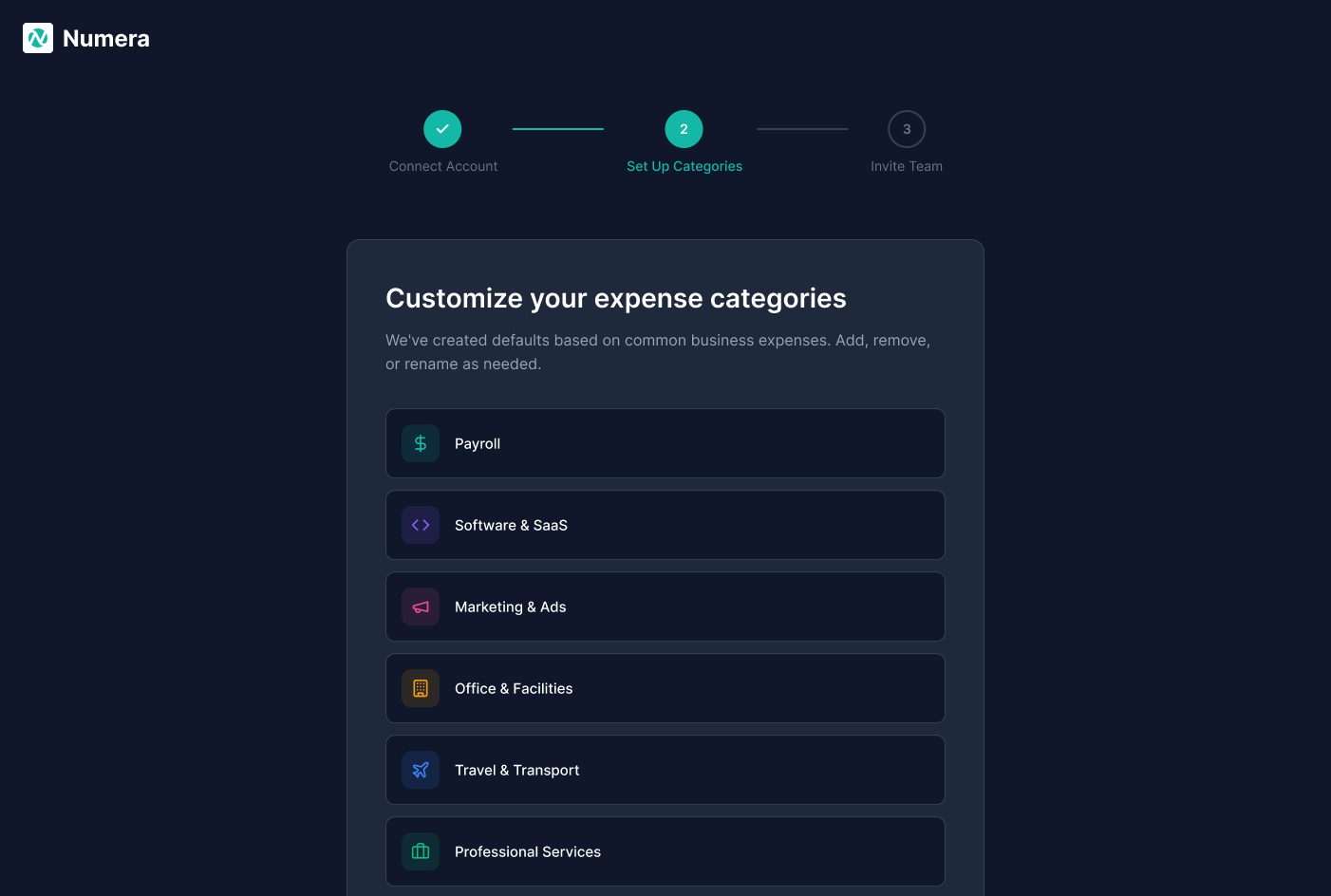
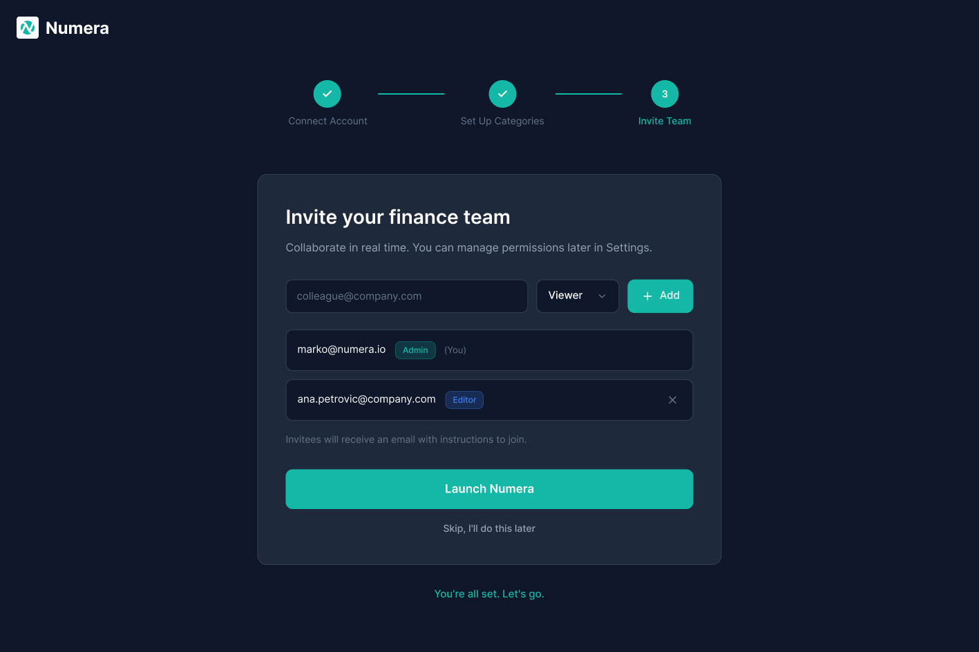
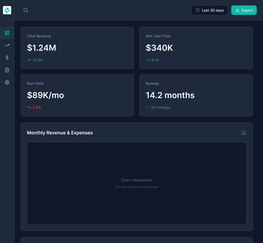
Numera
A fintech operations dashboard built around one question: how should the same surface behave when an analyst is using it at 8am and an executive is glancing at it at 5pm. Different reading speeds, different decisions, same data.