Back to work
Case Study
Product Design
SaaS Onboarding
UX/UI
Dark Mode
B2B
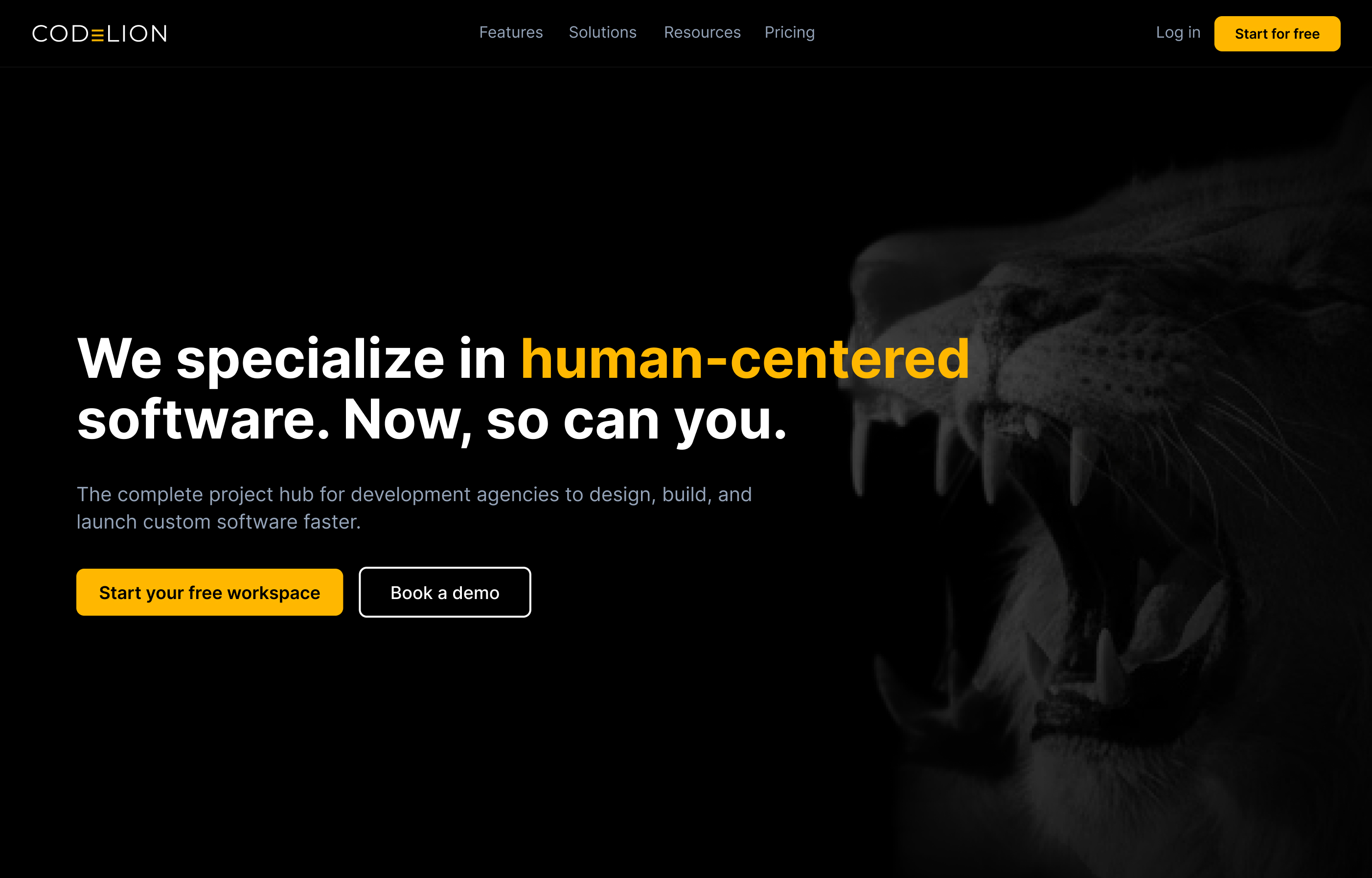
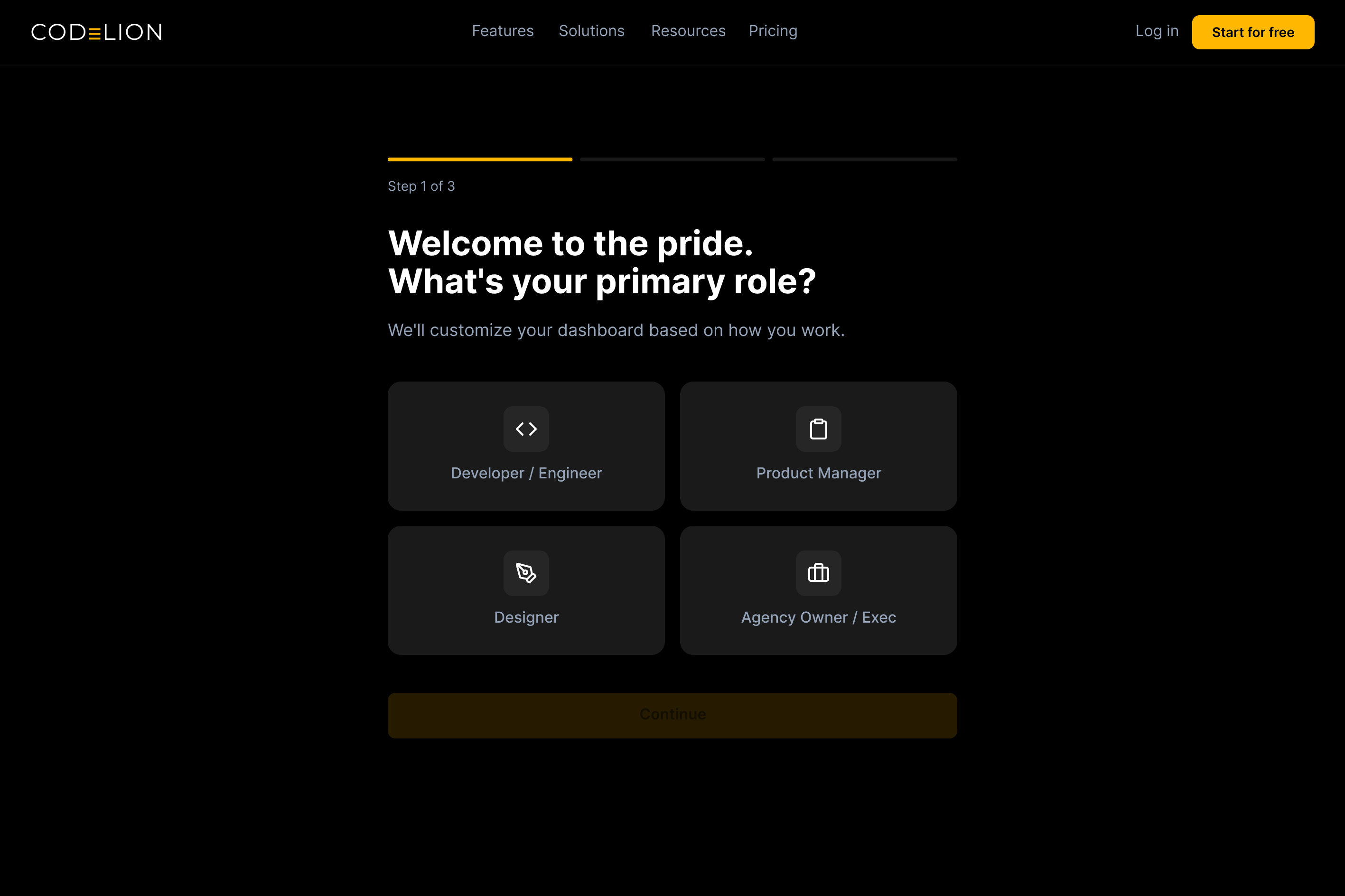
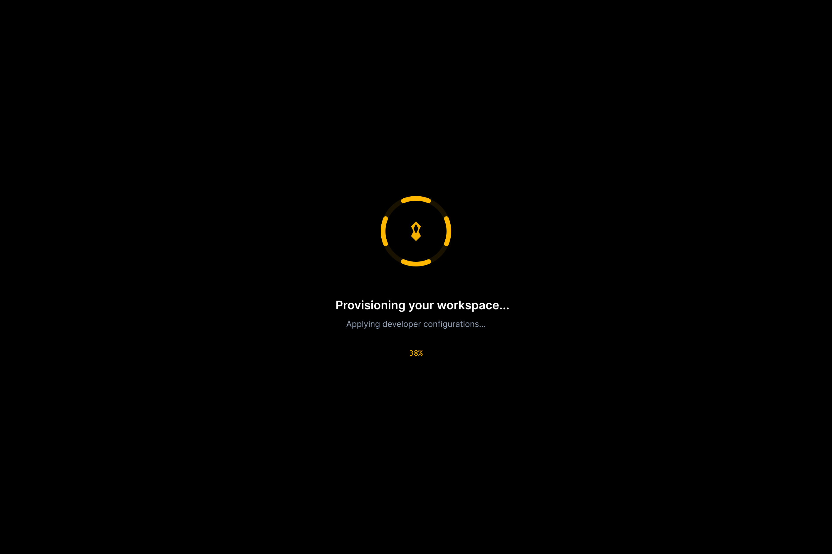
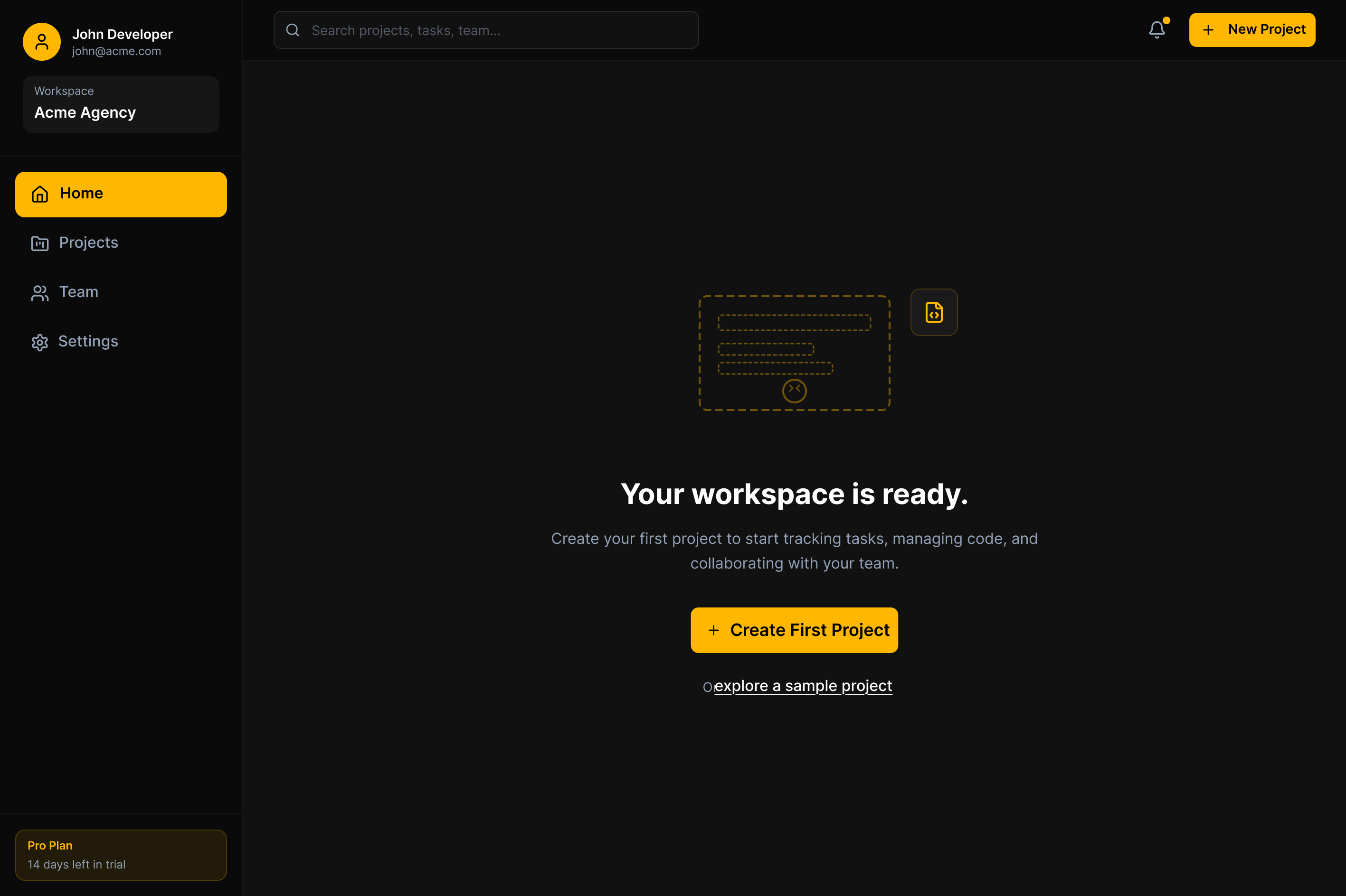
CodeLion
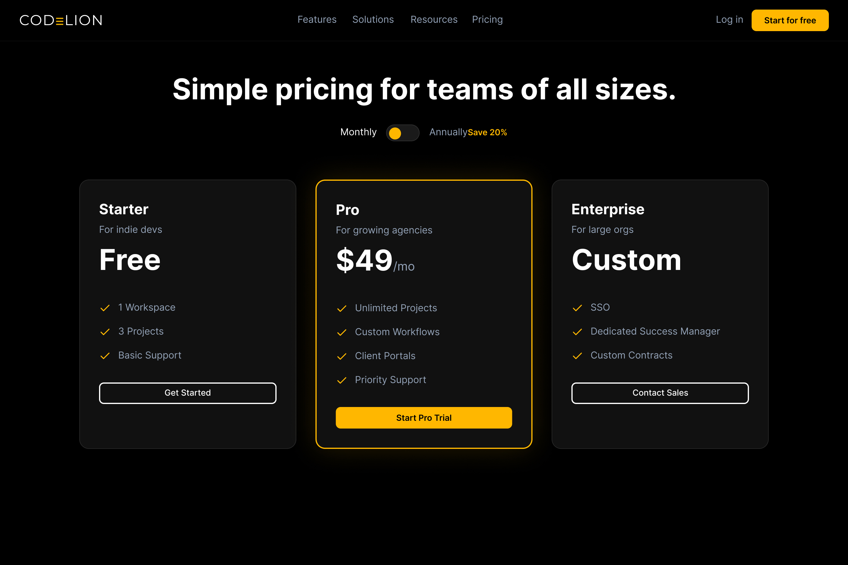
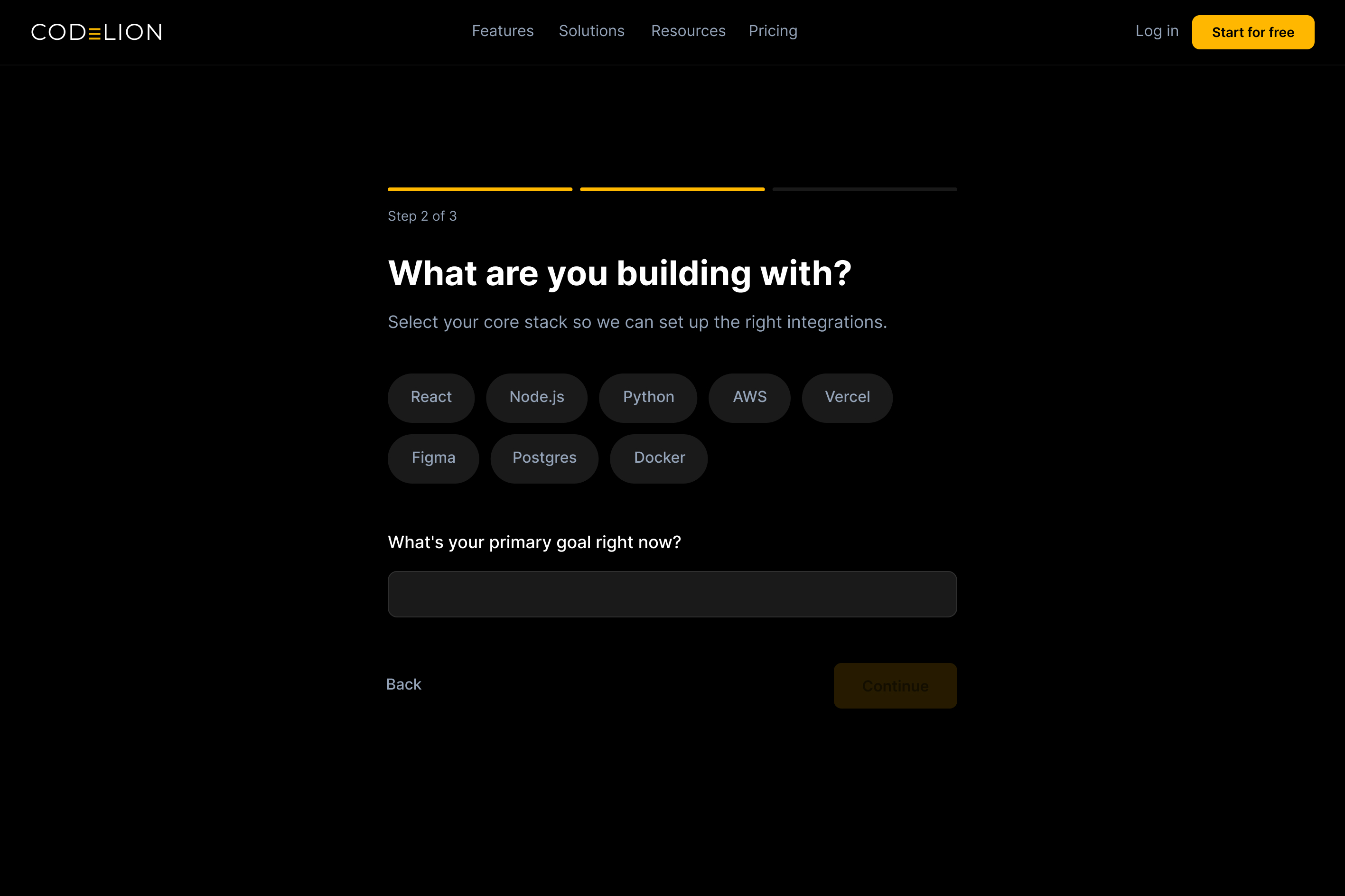
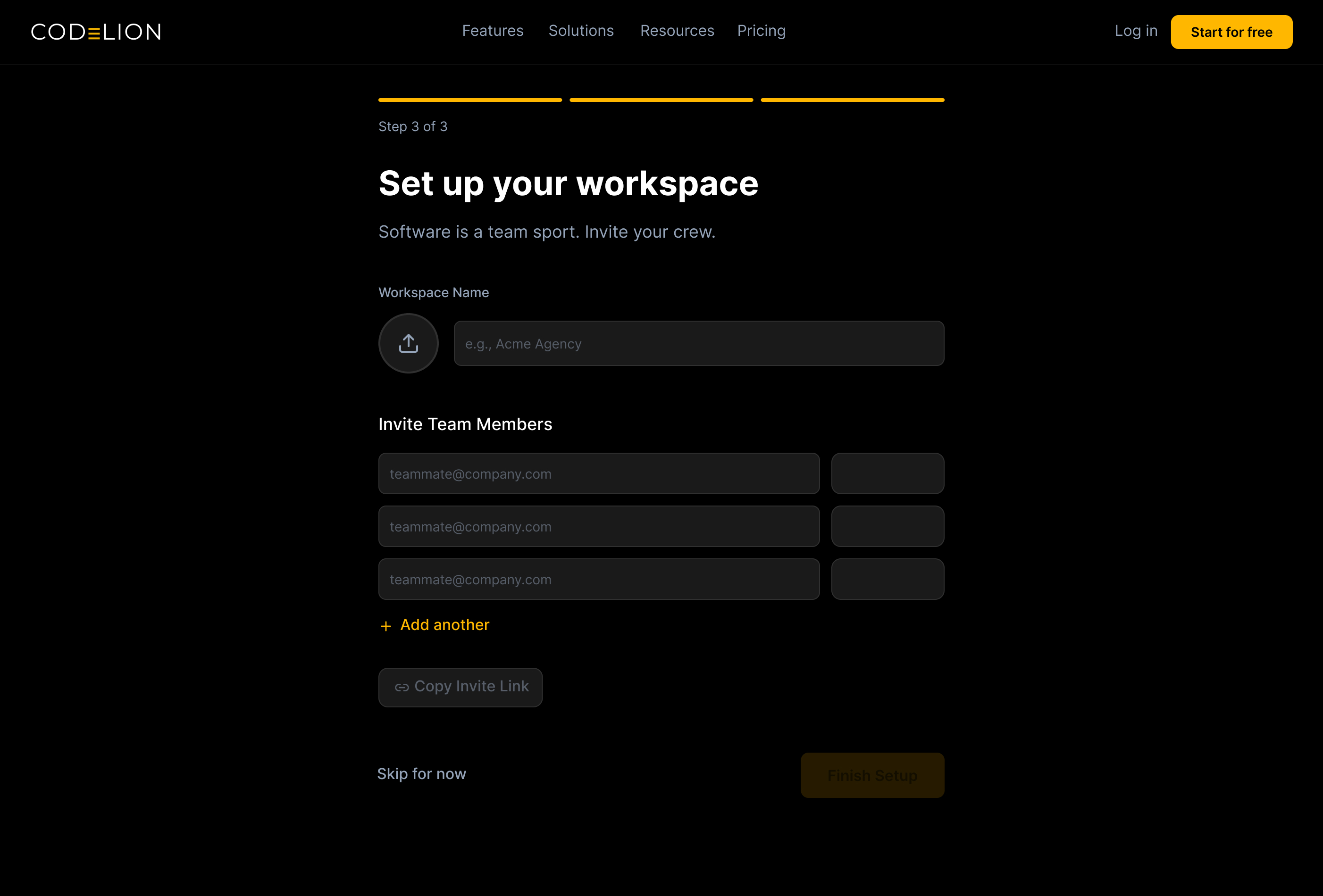
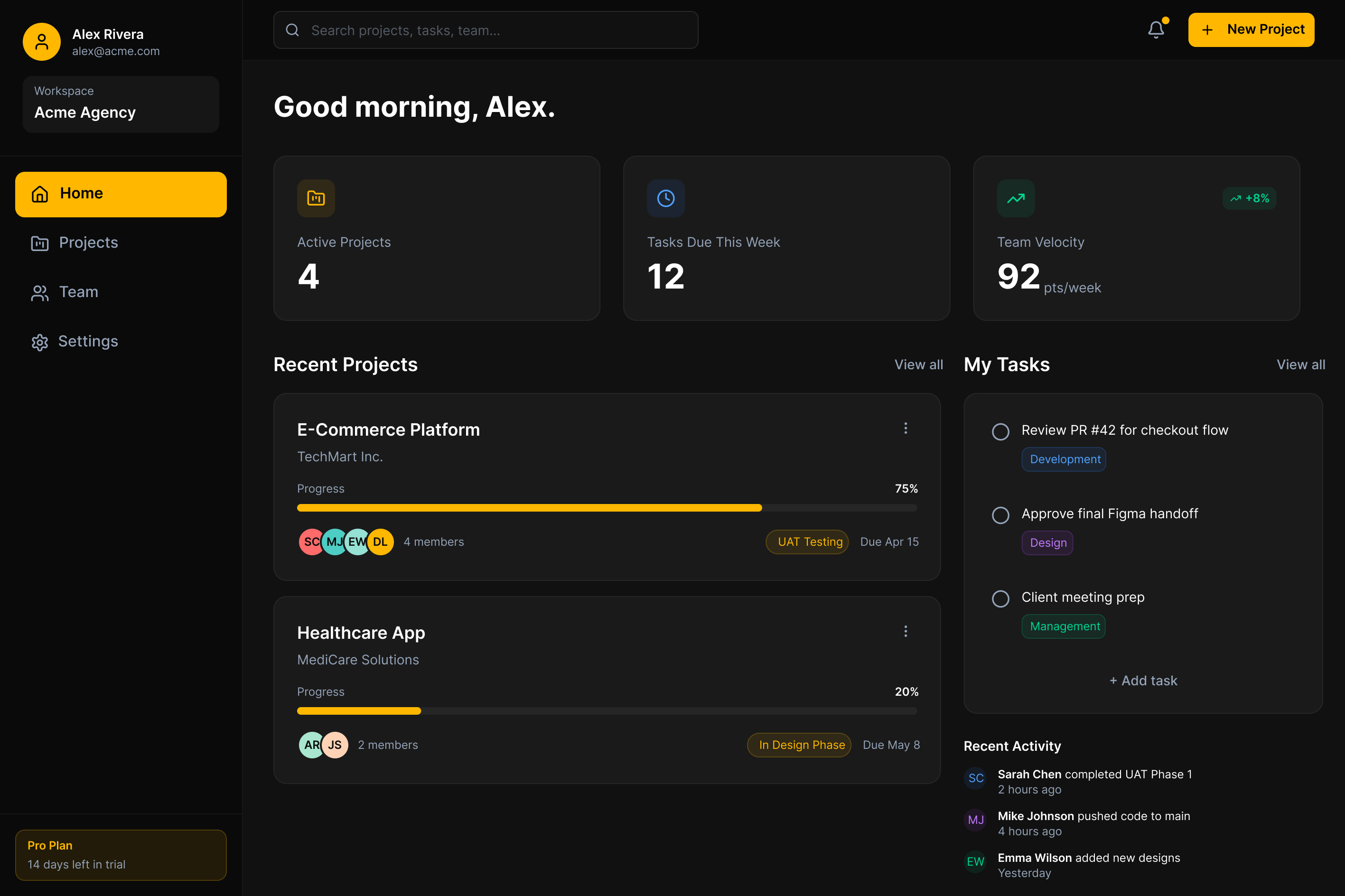
An onboarding flow built on the premise that first session activation is the only metric that matters for early stage SaaS. Bold dark gold identity, a single path from signup to first useful output, and a product surface designed to be defended in a stakeholder review.