Back to work
Case Study
Web Design
UI/UX
E-Commerce
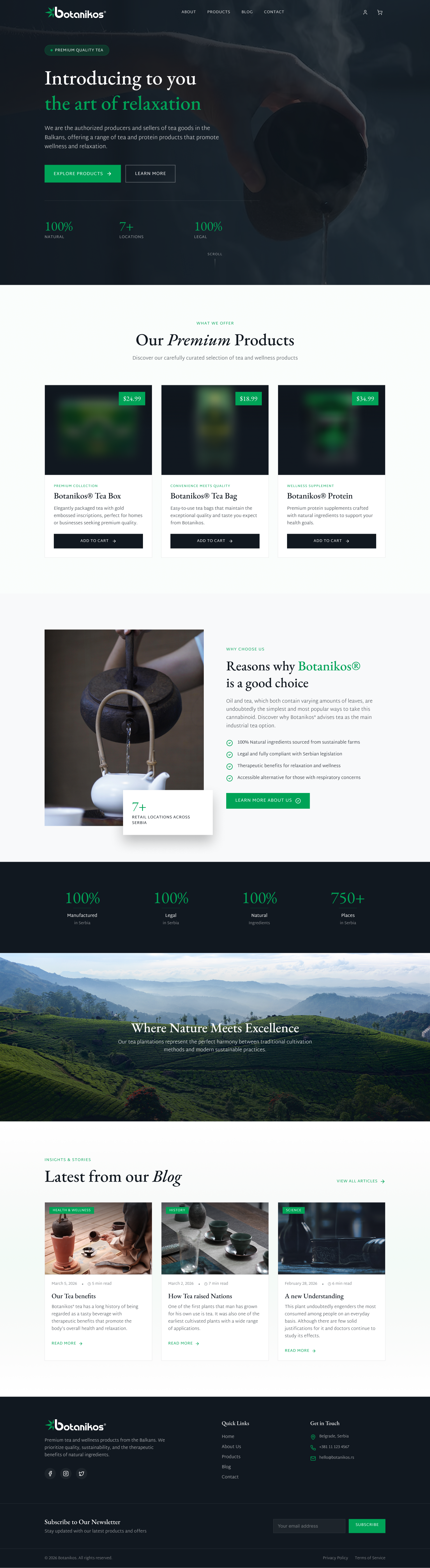
Botanikos
A premium ecommerce site for a botanical wellness brand. The design problem is positioning. A structured product grid and nature forward dark aesthetic that signals price tier before the first product page loads.
botanikos.com